Category: art direction
-

A die-cut above
Cover art for the 1971 prog-rock LP “Fearless,” by British band Family features a distinctive, die-cut cover design depicting the five band members gradually morphing into a single entity combining features of them all. Tom…
-
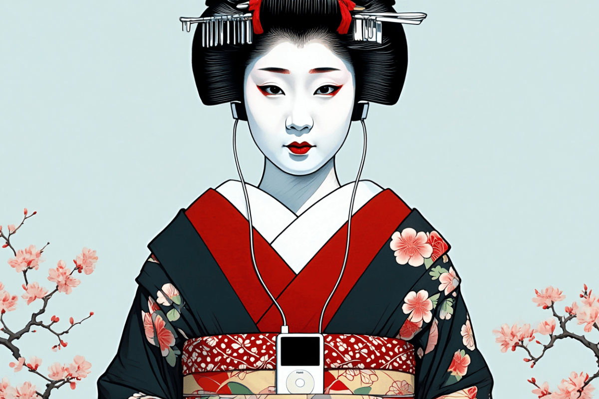
This Years Model
There’s a new AI model that can render photorealistic people and products, including text and logos. Geisha With Walkman is something I tried to draw 40 years ago, but my rendering skills were simply too…
-
Web Design Inspiration
If you’re finding today a bit stressful for some reason, grab a respite by sinking into any of these web design inspiration websites.
-

This Web of Ours, Revisited
Why did leading designers in 2000 look down their nose at the web? And are things any better today?
-
Just add water.
Quick, before everyone else thinks of it. Set the word “SUCCESSION” in Engravers Gothic and export it to a transparent PNG. Download photos of confederate general Mitch McConnell and Republican Johns Thune (R-S.D.), Cornyn (R-Texas),…
-
The Next Generation of Web Layouts
Who will design the next generation of readable, writerly web layouts? Layouts for sites that are mostly writing. Designed by people who love writing. Where text can be engaging even if it isn’t offset by…
-
Looking Back, Looking Ahead: artist Dan Licht
In 1999, I had the good fortune to work alongside Dan Licht at an NYC digital startup called SenseNet, RIP. Back then, although still in his early 20s, Dan was already an accomplished art director and digital…
-
My Night With Essl
Herewith, a scene from last night’s interview with legendary web & book designer (and Dean of The Cooper Union School of Art) Mike Essl, who shared his portfolio, career highlights, early web design history, and…
-

Rediscovering music
If Spotify exposes you to new music, Last.fm helps remind you of great music in your existing collection that may have slipped your mind.
-

The Web We Lost: Luke Dorny Redesign
Like 90s hip-hop, The Web We Lost™ retains a near-mystical hold on the hearts and minds of those who were lucky enough to be part of it. Luke Dorny’s recent, lovingly hand-carved redesign of his…
-

Expressive Design Systems
Yesenia Perez-Cruz started her career as a designer at Happy Cog Philadelphia. From the first day, her design gifts were unmistakable. As her career progressed, she moved from one challenging role to another. At companies…
-
Digital newspaper design challenge: a report from Poynter, part 1
CAN design create a better user experience that engages readers and drives revenue? Can it fight fake news and help save real journalism at a time when news organizations large and small are underfinanced and…
-

To Save Real News
IN a world where newspapers are dying and half the public believes fake news, what online news experiences need is design that is branded, authoritative, and above all, readable: Branded, because we need to convert…
-
Solve the Right Problem: Derek Featherstone on designing for extremes
12 LESSONS from An Event Apart San Francisco – ? 3: Derek Featherstone was the 10th speaker at An Event Apart San Francisco, which ended Wednesday. His session, Extreme Design, showed how creating great experiences…
-
CSS & Design: Blending Modes Demystified
With a few lines of CSS, we can now flexibly add Photoshop-level blending effects to our designs. Justin McDowell (@revoltpuppy) leads the way in today’s A List Apart, for people who make websites.