Category: Design
-

You lost me at “infielder.”
The instant a business guy uses a sports metaphor to make his most important strategic point, I am lost. If you want me to understand your business idea, try wrapping it in Wendy Carlos’s secrets…
-
The Secret
If I learned one thing in 25 years of running design and education companies, it’s that idealism isn’t a business strategy. If you wonder why my partners and I had to shut down organizations we…
-
Memories Can’t Wait—or, How I Learned to Keep Worrying About the Web
The web is still the best hope we have for a durable, shared memory. But it requires us to be gardeners, not merely tenants.
-
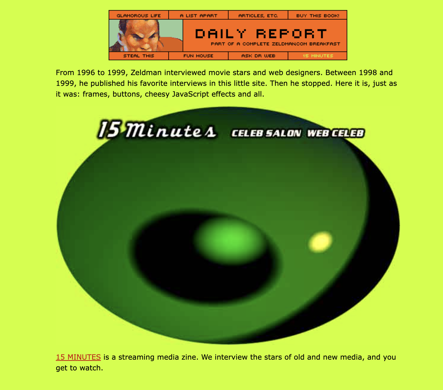
Remembrance of zeldman.coms past
Look back in anchor tags: a partial review of my site’s 31-year visual history before diving into the new design.
-

Required reading: “The Interracial Cuck Porn Theory of Everything”
Cameron Cummins-Smith’s grand unifying theory connects the far right’s seemingly disparate obsessions—from trans panic and great replacement theory to anti-feminism and white birth-rate anxiety—into a single ideological system fueled by pornographic narratives: In physics there…
-

The Courage to Stop
Brevity was always a discipline. Now it’s a statement.
-

Handwritten notes in the time of AI note takers
The best project management tool is still a pen, plus the discipline to notice what the machine cannot. Wisdom from Lucas Radke.
-
A die-cut above
Cover art for the 1971 prog-rock LP “Fearless,” by British band Family features a distinctive, die-cut cover design depicting the five band members gradually morphing into a single entity combining features of them all. Tom…
-
What a year that was.
Know your web design history.
-

The salad bar theory of UX professionalism
Less, but better? Not this week.
-
Claude Code for Designers
FIRST, the disclaimers: Some of my favorite writers—folks who are as anti-fascist and pro-democracy as they come—publish on Substack, but I read and recommend their work less and less frequently, because Substack has a Nazi…
-
Cold Storage
Good UX is what companies do when they have to. A company that has your stuff locked away doesn’t have to.
-
Accessibility is a human right, cruelty a human wrong.
Once more for the folks in the back. Calibri is easier than Times New Roman for folks with certain visual disabilities to read. That’s why the Biden Administration chose Calibri for their digital communications: to include…
-
Behind every successful launch, there are 100 interesting failures.
We must stop thinking of failure as an end of something, and learn to see it as a natural part of progress. The first incarnation of a new idea may die, but the best ideas…
-

Everybody’s lost it, Part I
My beloved veterinarian’s office apparently moved to a new office location without informing customers. They also changed phone systems. The new phone system doesn’t work, and they didn’t leave a forwarding message on the old…