We must stop thinking of failure as an end of something, and learn to see it as a natural part of progress. The first incarnation of a new idea may die, but the best ideas will find new lives. Behind every successful launch, there are 100 interesting failures.
Category: Ideas
Take them and run.
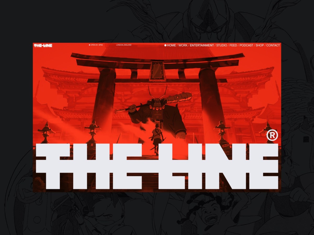
If you’re finding today a bit stressful for some reason, grab a respite by sinking into any of these web design inspiration websites.
Gathered from conversations on Reddit and elsewhere, each site offers a collection of other sites’ designs, chosen for impact, originality, and innovation. Each collection should offer at least a few designs that will inspire your own ideas and creativity—and most contain more than a few. Lots more.
We make no claims as to usability, accessibility, or appropriateness of design. Which doesn’t mean that the chosen websites are unusable, inaccessible, or inappropriate to the brand, subject matter, or needs of the audience. Indeed, from the care devoted to the graphical interface, we assume that many of these sites are as good under the hood as they are on the surface. But it’s just an assumption; we haven’t tested, and the point of this post is purely to share visual and creative inspiration. Enjoy!
- https://godly.website/ (collection)
- https://www.awwwards.com/ (collection)
- https://www.cssdesignawards.com/ (collection)
- https://land-book.com/ (collection)
- https://httpster.net/ (collection)
- https://goodui.org/ (UI patterns A/B tested, experiments)
- https://saaslandingpage.com/ (SaaS landing page examples)
- https://mobbin.com/browse/ios/apps (collection)
And for dessert…
Enjoy https://betteroff.studio/, an individual studio’s rhythmically organized, sensory-appealing design.
Corporations that take investors make an impossible promise to increase profits forever. Accordingly, they hire MBAs whose role is to juggle numbers to create ongoing, short-term profit. This juggling is frequently labeled “leadership.”
The juggling methods—abusing data, diminishing the primacy of the customer relationship, repeating what worked last year as if the demand for it will never end, and perpetually cutting costs—invariably remove value from the company. This, of course, results in more staff and cost cutting.
People who understand the customer and the product are ignored in favor of the number jugglers; research is disparaged in favor of a dogmatic relationship to data.
The people who wreck the company get the big paychecks. Eventually a bigger company buys the first company, further destroying its value. The wreckers exit with more money, 1980s-corporate-raider-style. Skilled workers are laid off, quality plummets, and the cycle begins again.
This picture of a business world with deeply misguided priorities—exemplified by horror stories from the worlds of tech, gaming, and entertainment—is brought to you by Doc Burford, whose discursive post, “the biggest threat facing your team, whether you’re a game developer or a tech founder or a CEO, is not what you think,” takes a while to get through, but is nonetheless worth reading.
It is not a picture of every company, to be sure. But it applies to many, and accounts for much of the worker unhappiness plus customer frustration that characterize this time and contribute to our political unrest.
I wrote this post so you’d know to check that one. Do it.
“Where the people are”
It’s nearly twenty years ago, now, children. Facebook had only recently burst the bounds of Harvard Yard. Twitter had just slipped the bonds of the digital underground. But web geeks like me still saw “social media” as a continuation of the older digital networks, protocols, listservs, and discussion forums we’d come up using, and not as the profound disruption that, partnered with smartphones and faster cellular networks, they would soon turn out to be.
So when world-renowned CSS genius Eric Meyer and I, his plodding Dr Watson, envisioned adding a digital discussion component to our live front-end web design conference events, our first thought had been to create a bespoke one. We had already worked with a partner to adapt a framework he’d built for another client, and were considering whether to continue along that path or forge a new one.
And then, one day, I was talking to Louis Rosenfeld—the Prometheus of information architecture and founder of Rosenfeld Media. I told Lou about the quest Eric and I were on, to enhance An Event Apart with a private social network, and shared a roadblock we’d hit. And Lou said something brilliant that day. Something that would never have occurred to me. He said: “Why not use Facebook? It already exists, and that’s where the people are.”
The habit of building
Reader, in all my previous years as a web designer, I had always built from scratch or worked with partners who did so. Perhaps, because I ran a small design agency and my mental framework was client services, the habit of building was ingrained.
After all, a chief reason clients came to us was because they needed something we could create and they could not. I had a preference for bespoke because it was designed to solve specific problems, which was (and is) the design business model as well as the justification for the profession.
Our community web design conference had a brand that tied into the brand of our community web design magazine (and soon-to-emerge community web design book publishing house). All my assumptions and biases were primed for discovery, design, development, and endless ongoing experiments and improvements.
Use something that was already out there? And not just something, but a clunky walled garden with an embarrassing origin story as a hot-or-not variant cobbled together by an angry, virginal undergraduate? The very idea set off all my self-protective alarms.
A lesson in humility
Fortunately, on that day, I allowed a strong, simple idea to penetrate my big, beautiful wall of assumptions.
Fortunately, I listened to Lou. And brought the idea to Eric, who agreed.
The story is a bit more complicated than what I’ve just shared. More voices and inputs contributed to the thinking; some development work was done, and a prototype bespoke community was rolled out for our attendees’ pleasure. But ultimately, we followed Lou’s advice, creating a Facebook group because that’s where the people were.
We also used Twitter, during its glory days (which coincided with our conference’s). And Flickr. Because those places are where the people were.
And when you think about it, if people already know how to use one platform, and have demonstrated a preference for doing so, it can be wasteful of their time (not to mention arrogant) to expect them to learn another platform, simply because that one bears your logo.
Intersecting planes of simple yet powerful ideas
Of course, there are valid reasons not to use corporate social networks. Just as there are valid reasons to only use open source or free software. Or to not eat animals. But those real issues are not the drivers of this particular story.
This particular story is about a smart friend slicing through a Gordian Knot (aka my convoluted mental model, constructed as a result of, and justification for, how I earned a living), and providing me with a life lesson whose wisdom I continue to hold close.
It’s a lesson that intersects with other moments of enlightenment, such as “Don’t tell people who they are or how they should feel; listen and believe when they tell you.” Meet people where they are. It’s a fundamental principle of good UX design. Like pave the cowpaths. Which is really the same thing. We take these ideas for granted, now.
But once, and not so long ago, there was a time. Not one brief shining moment that was known as Camelot. But a time when media was no longer one-to-many, and not yet many-to-many. A time when it was still possible for designers like me to think we knew best.
I’m glad a friend knew better.
Afterword
I started telling this story to explain why I find myself posting, sometimes redundantly, to multiple social networks—including one that feels increasingly like Mordor.
I go to them—even the one that breaks my heart—because, in this moment, they are where the people are.
Of course, as often happens, when I begin to tell a story that I think is about one thing, I discover that it’s about something else entirely.
Quick, before everyone else thinks of it. Set the word “SUCCESSION” in Engravers Gothic and export it to a transparent PNG. Download photos of confederate general Mitch McConnell and Republican Johns Thune (R-S.D.), Cornyn (R-Texas), and Barrasso (R-Wyo.). Grab and burn Nicholas Britell’s main title theme from Succession. Import all files into Final Cut Pro or Adobe After Effects. Add dissolves, fades, and film scratch overlays. Export. Upload to YouTube or Vimeo. Embed and amplify via all 500 social media networks. Sit back, relax, and bask in your 15 seconds of glory.
“Succession” is copyright HBO. Mitch McConnell is a wholly owned subsidiary of the NRA.
“Led” is the past tense of “lead.”
L.E.D. Not L.E.A.D.
Example: “Fran, who leads the group, led the meeting.”
When professional publications get the small stuff wrong, it makes us less trusting about the big stuff. Trust in media is already at an all-time low. Don’t alienate liberal arts majors and obsessive compulsives. We may be the last readers standing.
In search of a digital town square
Ever since an infantile fascist billionaire (hereafter, the IFB) decided to turn Twitter over to the racially hostile anti-science set, folks who previously used that network daily to discuss and amplify topics they cared about have either given up on the very premise of a shared digital commons, continued to post to Twitter while holding their noses, or sought a new digital place to call their own. This post is for the seekers, to compare notes.
These are my personal observations; your views may differ (and that’s more than okay). In this quick survey, I’m omitting specialty platforms like Tribel, Post, and Substack. Feel free to comment, if you like.
The platforms
BlueSky: The most beautifully elegant web interface. Also the best features (other than omission of hashtags). What Twitter should have become. I joined late—Jack didn’t invite me, likely a sign that I was no longer industrially relevant. I have few followers there, and my posts so far get little traction, but that could change. It’s so pretty (and the few friends that use it matter so much to me) that I keep using it, and I reserve judgement as to its future potential. https://bsky.app/profile/zeldman.bsky.social
Threads: Currently my primary alternative to Twitter, and the only place besides Twitter where my posts get at least some response. Not as visually refined as BlueSky, and with a curiously restricted single-hashtag-only policy. Although this editorial decision helps focus the mind, and likely also cuts down on spam, it interferes with amplifying multidimensional posts. But I digress.
Rough edges and restrictive tagging aside, Threads feels like the place that’s likeliest to inherit the mantle of default town square—if any social platform can do that in these new times, that is.
Threads got its huge jump start because, while the IFB was busy finding new ways to make Twitter less useful and more dangerous, Meta leveraged its huge installed Instagram base to give users a more or less instant social network hookup. If it’s easy, and comes with a built-in network of people I already follow, it wins—at least initially.
Meta may also blow their opportunity if they pursue misguided policies, such as impeding (by algorithmic fiat) “political speech” when democracies hang in the balance, regional wars threaten to become world wars, and the climate crisis is approaching a point of no return. https://www.threads.net/@zeldman
Mastodon: How do you decentralize a digital town square? Provide universal social connection without locking in participants? Mastodon (and federation generally) are an attempt to do those things.
These are important and noble goals, but Mastodon (and federation generally) are a long shot at replacing a primary walled garden like Twitter because they require a fair degree of geekery to set up, and the price tag of mass acceptance is ease of setup. (Compare Threads—easy set-up, built-in friends and followers if you already use Instagram—versus the learning curve with Mastodon.)
If BlueSky is MacOS and Threads is Windows, Mastodon is Linux: a great choice for techies, but likely too steep a hill for Ma and Pa Normie. A techie friend invited me to join, and I write there frequently, but, for whatever it’s worth, my Mastodon posts get very little in the way of responses. It is, nonetheless, a highly effective network for most who use it. https://front-end.social/@zeldman
Tumblr: A bit o’ the OG weird wacky wonderful web, and a special place for nonconformist creative types. By its nature, and the nature of its fiercely loyal users, it is a cult jam. I was an early and enthusiastic Tumblr fan, but it was never my main axe, probably because, since the dawn of time itself, I have had zeldman.com.
For a while, when the IFB first started wrecking Twitter, an uptick in Tumblr usage suggested that the funky old network just might take over as the world’s town hall, but this hope was unrealistic, as Tumblr was never about being for everybody, and Tumblristas are mostly happy keeping the platform a home for self-selecting freaks, queers, and creatives.
I’ll note that Tumblr is part of the Automattic family, and I work at Automattic (just celebrated my fifth anniversary there!), but my opinions here are mine alone. BTW—in nearly 30 years of blogging, that’s the first time I’ve used that phrase. https://apartness.tumblr.com
LinkedIn: A comparatively safe social network with a huge network built up over years, hence a great place to share work-related news and ideas.
Some early Twitter adopters of my acquaintance—especially those who mainly write about work topics like UX—have made LinkedIn their primary social home. For most working folks, it is undoubtedly a place to post and amplify at least some of the content that matters to you. OTOH, it’s not a place where I’d share deep takes on CSS (that’s probably Mastodon), cosplay (Tumblr), or personal true confessions (one’s blog, Threads, Twitter before the IFB took over). https://www.linkedin.com/in/zeldman
Twitter itself: During its heyday, before the IFB, and when it was the only game in town, I loved going there to see what clever things my smartest friends were saying, post my own bon mots, and promote content that mattered to me.
I’ll limit my comments on Twitter’s current state to noting that I still post there, from stubbornness as well as habit, and primarily in the (increasingly forlorn) hope that the IFB will eventually tire of his toy, or of the ceaseless financial hemorrhage, and go away, leaving the site to rebirth itself as an open source project or under the care of new, non-fascist owners.
Though the algorithm punishes my posts, and though I’m continually appalled by the MAGA posts, Russian disinformation, racist/ misogynist/ anti-semitic spew, and Trumpian ego of the current owner, I shall, at least for now, continue to defend my tiny turf there.
Algorithm & Blues
Examining last week’s Verge-vs-Sullivan “Google ruined the web” debate, author Elizabeth Tai writes:
I don’t know any class of user more abused by SEO and Google search than the writer. Whether they’re working for their bread [and] butter or are just writing for fun, writers have to write the way Google wants them to just to get seen.
I wrote extensively about this in Google’s Helpful Content Update isn’t kind to nicheless blogs and How I’m Healing from Algorithms where I said: “Algorithms are forcing us to create art that fits into a neat little box — their neat little box.”
Is the Internet really broken?
So, despite Sullivan’s claims to the contrary, the Internet has sucked for me in the last 10 years. Not only because I was forced to create content in a way that pleases their many rules, but because I have to compete with SEO-optimized garbage fuelled by people with deep pockets and desires for deep pockets.
For digital creators who prefer to contain multitudes, Tai finds hope in abandoning the algorithm game, and accepting a loss of clout, followers, and discoverability as the price of remaining true to your actual voice and interests:
However, this year, I regained more joy as a writer when I gave upon SEO and decided to become an imperfect gardener of my digital garden. So there’s hope for us yet.
As for folks who don’t spend their time macro-blogging—“ordinary people” who use rather than spend significant chunks of their day creating web content—Tai points out that this, statistically at least a more important issue than the fate and choices of the artists formerly known as digerati, remains unsolved, but with glimmers of partially solution-shaped indicators in the form of a re-emerging indieweb impulse:
Still, as much as I agree with The Verge’s conclusions, I feel that pointing fingers is useless. The bigger question is, How do we fix the Internet for the ordinary person?
The big wigs don’t seem to want to answer that question thoroughly, perhaps because there’s no big money in this, so people have been trying to find solutions on their own.
We have the Indieweb movement, the Fediverse like Mastodon and Substack rising to fill the gap. It’s a ragtag ecosystem humming beneath Google’s layer on the Internet. And I welcome its growth.
For more depth and fuller flavor, I encourage you to read the entirety of “Is the internet really broken?” on elizabethtai.com. (Then read her other writings, and follow her on our fractured social web.)
“The independent content creator refuses to die.” – this website, ca. 1996, and again in 2001, paraphrasing Frank Zappa paraphrasing Edgar Varese, obviously.
Hat tip: Simon Cox.

New episodes of Harrison Wheeler’s Technically Speaking podcast are coming, and Technically Speaking will run live interviews at San Francisco Design Week June 7–13.
The podcast amplifies voices of underrepresented leaders who want to inspire the next generation of black and brown designers through authentic, thought-provoking, and immersive storytelling.
Learn more on the podcast’s homepage, listen to past episodes, and sign up for the newsletter to be notified about upcoming content.
Saving Your Web Workflows with Prototyping
Our static tools and linear workflows aren’t the right fit for the flexible, diverse reality of today’s Web. Making prototyping a central element of your workflows will radically change how you approach problem solution and save you a lot of headaches – and money. But most importantly, you will be creating the right products and features in a way that resonates with the true nature of the Web. A discourse on processes, flexibility, the Web as a material, and how we build things.
Saving Your Web Workflows with Prototyping – Matthias Ott
Like 90s hip-hop, The Web We Lost™ retains a near-mystical hold on the hearts and minds of those who were lucky enough to be part of it. Luke Dorny’s recent, lovingly hand-carved redesign of his personal site encompasses several generations of that pioneering creative web. As such, it will repay your curiosity.
Details, details.
Check Luke’s article page for textural, typographic, and interactive hat tips to great old sites from the likes of k10k, Cameron Moll, Jason Santa Maria, and more.
And don’t stop there; each section of the updated lukedorny.com offers its own little bonus delights. Like the floating titles (on first load) and touchable, complex thumbnail highlights on the “observer” (AKA home) page.
And by home page, I don’t mean the home page that loads when you first hit the site: that’s a narrow, fixed-width design that’s both a tribute and a goof.
No, I mean the home page that replaces that narrow initial home page once the cookies kick in. Want to see the initial, fixed-width home page again? I’m not sure that you can. Weird detail. Cool detail. Who thinks of such things? Some of us used to.
And don’t miss the subtle thrills of the silken pull threads (complete with shadows) and winking logo pull tab in the site’s footer. I could play with that all day.

Now, no site exactly needs those loving details. But danged if they don’t encourage you to spend time on the site and actually peruse its content.
There was a time when we thought about things like that. We knew people had a big choice in which websites they chose to visit. (Because people did have a big choice back in them days before social media consolidation.) And we worked to be worthy of their time and attention.
Days of future past
We can still strive to be worthy by sweating details and staying alive to the creative possibilities of the page. Not on every project, of course. But certainly on our personal sites. And we don’t have to limit our creative love and attention only to our personal sites. We pushed ourselves, back then; we can do it again.
In our products, we can remember to add delight as we subtract friction.
And just as an unexpected bouquet can brighten the day for someone we love, in the sites we design for partners, we can be on the lookout for opportunities to pleasantly surprise with unexpected, little, loving details.
Crafted with care doesn’t have to mean bespoke. But it’s remarkable what can happen when, in the early planning stage of a new project, we act as if we’re going to have to create each page from scratch.
In calling Luke Dorny’s site to your attention, I must disclaim a few things:
- I haven’t run accessibility tests on lukedorny.com or even tried to navigate it with images off, or via the keyboard.
- Using pixel fonts for body copy, headlines, labels, and so on—while entirely appropriate to the period Luke’s celebrating and conceptually necessary for the design to work as it should—isn’t the most readable choice and may cause difficulty for some readers.
- I haven’t tested the site in every browser and on every known device. I haven’t checked its optimization. For all I know, the site may pass such tests with flying colors, but I tend to think all this beauty comes at a price in terms of assets and bandwidth.
Nevertheless, I do commend this fine website to your loving attention. Maybe spend time on it instead of Twitter next time you take a break?
I’ll be back soon with more examples of sites trying harder.
THIS year’s Poynter Digital Newspaper Design Challenge was an attempt by several designers and pundits, working and thinking in parallel, to save real news via design. In Part 1 of my report from Poynter, I discussed the questions driving the challenge, and talked about the design work done in response to it by my colleagues Kat Downs Mulder, Mike Swartz, Lucie Lacava, and Jared Cocken. Here in Part 2, I’ll discuss my own work and the approach we took at my studio. But we begin with a quick look back at the past designs that brought us to this point:
Experiment 1: The Deck
During the past decade and a half, as both a publication designer and a publisher, I watched in horror as our publications became reader-hostile minefields of intrusive ads, overlays, and popups. The first thing I tried to do about this (besides removing the web equivalent of chart junk from my magazine) was to offer an alternative approach to advertising via The Deck, an ad network I cofounded with Jim Coudal of coudal.com and Jason Fried of Basecamp (formerly 37signals). The Deck permitted only one appropriately targeted ad per each page of content viewed. As primary instigator Jim Coudal put it:
A buy in The Deck reaches the creative community on the web in an uncluttered, controlled environment, far more valuable than a standard banner or a single text ad among dozens of others.
Jim, Jason, and I hoped that our cost-per-influence model would replace the CPM race to the bottom, and that our quasi-religious use of whitespace would be widely imitated by the smartest publications online.
But that didn’t happen. Advertising just got more intrusive. The Deck succeeded as a small business supporting a network of interesting small publications, but not at all as a primary influencer on the direction taken by advertising that supports web content.
Experiment 2: Readability
Then about seven years ago, my friend Rich Ziade and his engineers created Readability, an app that sat between you and the ugly site you were trying to read, the way screen readers sit between visual websites and blind web users. Readability grabbed an article page’s primary content, removed the junk, and replaced the cluttered and illegible layout with a clean, readable page inspired by the clarity of iBooks and Kindle, which were just taking off at the time.
Rich released Readability 1.0 as open source; Apple immediately absorbed it into the Safari browser, where it continues to provide Safari’s built-in “reader” mode. (Safari’s “reader” mode was Apple’s first step in decluttering the web and returning it to the people who use it; “content blocking” would be the second step.)
Moreover, Readability 2.0, released by Rich’s then-company Arc90 the following year, added automatic payment for content creators slash publishers, as I explained at the time to anyone who would listen. Had Readability been allowed to continue the experiment, content monetization might have been less of a problem than it is today, and publication brands (the notion that it matters who publishes what we read) would be in exactly the same pickle they’re in anyway—except that readers would get their news in Readability’s attractive and customizable format, instead of from Apple News, Facebook, and the like.
I used to go around the world on lecture tours, warning my fellow designers that if we didn’t figure out how to declutter and compellingly brand sites, apps like Readability would do it for us. I still go around on lecture tours, but I’ve moved on to other issues. As for Readability, it was killed by a digital lynch mob after one powerful blogger, misunderstanding the motivation behind it, issued the digerati equivalent of a fatw?. But that’s another story.
Experiment 3: Big Type Revolution
In 2012, inspired by Readability and frustrated by the industry’s determination to make ever less legible, ever more cluttered sites full of tracking and popups and everything except what readers need, I bet big on large type:
This redesign is a response to ebooks, to web type, to mobile, and to wonderful applications like Instapaper and Readability that address the problem of most websites’ pointlessly cluttered interfaces and content-hostile text layouts by actually removing the designer from the equation. (That’s not all these apps do, but it’s one benefit of using them, and it indicates how pathetic much of our web design is when our visitors increasingly turn to third party applications simply to read our sites’ content. It also suggests that those who don’t design for readers might soon not be designing for anyone.)
Writing in Forbes, Anthony Wing Kosner saw the future in my initially crude experiment:
If you want to know where the web is going, one clue is to look at the personal sites of top-tier web designers. And one trend that just bubbled to the surface is large body type—the kind you don’t have to command-plus to read.
Jeffrey Zeldman…made a particularly strong point about it in his “Web Design Manifesto 2012,” that he published yesterday.
—Large Type: One Web Designer Puts Content First in a Big Way
Not to brag (okay, too late), but he wasn’t wrong. It was the future.
(Also, I’m fairly sure I wasn’t the only designer at the time who reacted against tiny type and cluttered anti-user layouts by stripping pages down to only their most necessary elements, and boosting the type size to enforce a more relaxed reading posture. The idea was in the air.)
The experiment becomes the norm
In any case, soon enough, readable (big type and plenty of whitespace) layouts starting popping up everywhere. At medium.com. In Mike Pick’s redesign of A List Apart. In article pages for The New York Times, Washington Post, Vox, Newsweek, The New Yorker, and, eventually, many other publications.
An uncluttered page focused on the reading experience (reminder: big type and plenty of whitespace) is now the default at several leading news publications. But many smaller publications, struggling just to survive, have not kept up. And so we have a perfect crisis:
Publications that do not encourage reading, loyalty, or repeat visits are struggling to survive at the very moment real news is under attack from an authoritarian president. What to do?
My response to the Poynter Design Challenge
There are many ways to respond to an existential crisis like the one facing most news publications. You can rethink the relationship between reader and publication. Rethink the job of the publication. Make news work more like a lifestyle app. Make it more immersive. My colleagues followed those paths out brilliantly (as described in Part 1).
But I went for the low-hanging fruit. The thing any publisher, no matter how cash-strapped, could do. The thing I had seen working since I started yelling about big type in 2012. I went for a clean, uncluttered, authoritative, branded page. Authoritative because this isn’t fake news. Branded because the source matters.
The easiest, fastest, most readily attainable path to clean, uncluttered, authoritative, branded design is through typography.
Any publication can be readable
Any newspaper, however poor, can afford better typography. Any newspaper with a designer on staff can attain it, if the paper stops treating design as a lackey of marketing or editorial or advertising, and sets designers free to create great reading experiences.
In my work, which is still underway (and will continue for some time), I focused on creating what I call “reader” layouts (and probably other designers call them that too; but I just don’t know). Layouts that are branded, authoritative, clean, uncluttered, and easy to read.
I played with type hierarchies and created simple style guides. Most of my little pages began as Typecast templates that I customized. And then Noël Jackson from my studio cleaned up the HTML and CSS to make it more portable. We put the stuff up on GitHub for whoever wants to play with it.
- Reader layout & readme
- Style guide (from a template by John Martins) & readme
These are only starting points. Any designer can create these kinds of layouts. There’s nothing special about what I did. You can do the same for your paper. (And if you can’t, you can hire us.)
The work I share here is the start of a project that will continue at our studio for a long time. #realnews for the win!
Additional reading
- To Save Real News
- The Year in Design
- Digital Newspaper Design Challenge: A Report from Poynter – Part 1
- Ad Blocking and the Future of the Web
- In Defense of Font Size Widgets
- Publishing Versus Performance: Our Struggle for the Soul of the Web
- The Nation, America’s oldest weekly news magazine, launches responsive, large-type redesign
- “Design doesn’t matter”
- Understanding Web Design
- A List Apart 4.0
CAN design create a better user experience that engages readers and drives revenue? Can it fight fake news and help save real journalism at a time when news organizations large and small are underfinanced and under attack?
These questions drove the Poynter Design Challenge, “a project to create new visual models for digital news publications” sponsored by William R. Hearst III, hosted by the Poynter Institute, and directed by publication designer Roger Black.
The challenge began October 17–18 in New York, with five pundits and five designers, of whom I was honored to be one, workshopping a project brief during a two-day conference event at the Columbia Journalism School. (You can watch videos of all these sessions courtesy of Fora.tv.)
The next phase took place yesterday in St. Petersburg, Florida, as the four other designers and I presented our work to a live audience. In this short piece, I’ll talk about the designs my colleagues presented; in the next, I’ll discuss my own.
Reconnecting with the people: the challenge for digital news
Roger Black described the difficulties facing digital news publications:
The challenge is serious. Fake news crowds real news. Numbers no longer add up for publishers. Readers jump from site to site without knowing where they are, or staying for long. You can see the brief for this project here.
Can design help? Well, as a I designer, I think it can. I mean, the design of most news pages is not what you’d call attractive. But the solutions proposed at Poynter will be much more strategic than cosmetic. And they’re strategies that can be combined.
—Five design answers that add up, Roger Black, January 20, 2017
“A news publication might think a bit more like Fitbit”
Between us, we designers had about a century of experience designing digital publications—internally, as consultants, or both. This means that, even though an open “design challenge” brief necessarily omits an unknown number of the specific requirements any actual publication design assignment would include, all of us were aware of, and to some degree addressed, typical news publication requirements not included in our brief.
Kat Downs Mulder, Graphics Director at The Washington Post, shared a prototype for a big-brand news site. Kat had just given birth to a healthy baby boy (congratulations!), so her work was presented by two of her colleagues from The Post. Kat did not design with the avid, committed news reader in mind (since those folks are not the problem for most publications). Instead, she pondered how to engage the typically fragmented attention of today’s distracted and passive news reader:
“A big-brand news site [should be] aware that people have a lot more to do in their lives than read the news,” Kat posited. Thus, “A news publication might think a bit more like Fitbit. That is, it should make you feel like it’s working for you. A reader should say, ‘I’m reading everything I need to know.’”
Keep that dopamine pumping
Kat presented a multi-paned prototype. The wider pane on the right contained news content; the narrower pane at left was navigation. As I’ve just described it, this isn’t much different from the current Post website, but Kat’s prototype was very different, because it prized reader control over editorial director control; kept track of what you read; encouraged extra reading the way Fitbit encourages extra steps, and rewarded it the same way Fitbit does, with an accumulation of points that give the reader dopamine hits and create the perception that the “news app” is working for her—as a rewarding part of her busy lifestyle.
An Operating System for your city
Mike Swartz, Partner at Upstatement, a design and engineering studio in Boston, took on the challenge to smaller publications (such as his original hometown paper, the Pittsburgh Post-Gazette) which lack the resources of a Washington Post or New York Times.
Mike’s presentation, “information OS for a city: redefining the opportunity for local media,” turned the journalistic prowess of a good local paper into a superpower, connecting readers to their city the way the “terrible towel” stunt concocted in desperation by radio announcer Myron Cope in 1975 reconnected Pittsburghers to their hometown football team, and helped the Steelers win Super Bowl X over the Dallas Cowboys.
There’s a potential for an operation like the [Post Gazette] to rebrand itself as more of an “informational operating system” for its city. With different types of products that are focused and useful and not necessarily bundled into a traditional news format, we can create more enjoyable experiences and more useful products readers will love.
Building reader interest and finding a way to pay for it all

Where the rest of us avoided the elephant in the room, in her design Lucie Lacava, president of Lacava Design Inc., boldly confronted the challenges of advertising and monetization. Algorithm-driven advertising frustrates users, who, in desperation, block it. Choked for income as a result, publications and advertisers create more and more intrusive forms of unwanted advertising. Nobody wins.
And while subscription models have worked, at least partly, for some of the very top news publications, such models are not likely to help most news publications in the near term.
Digital publication as digital application
Lucie’s design addressed these challenges by recasting the news as a hyper-customized application targeted at younger users, who get to choose news streams and ads that are relevant to them. “The elusive millennial” was Lucie’s target. I cannot do her idea justice with a couple of paragraphs and a single screen shot.
Affordable, immersive VR is here
Jared Cocken, brand and product designer for hire and co-founder of STYLSH.co., approached the “attention war” by showing how any size publication could create “video or VR driven stories that enrich a user’s understanding of the world around them.”
Because VR video is immersive, it holds viewer attention. Because it is reality-based, it fights fake news. (It’s hard to call bullshit on a scene you can explore from any angle.) VR also, potentially, builds compassion. It’s one thing to read about conditions in a Syrian refugee camp, another to visually experience them in VR.
Until now VR and video have been cost-prohibitive, but, working (and co-presenting) with VR startup founder Anna Rose and Hollywood producer/actor Banks Boutté, Jared showed how even woefully under-financed newsrooms can use newly designed, super-affordable tools to create “video or VR-driven stories that enrich a user’s understanding of the world around them.”
(For more on VR and the web, see webvr.info and VR Gets Real with WebVR by studio.zeldman’s Roland Dubois.)
Parting thought for now
Blogging about a conference is like tweeting about a sexual experience. You had to be there. I wanted to record and share the outlines of what my fellow designers presented, but these few paragraphs should in no way be considered authentically representative of the deep thinking and work that went into every presentation.
You may see holes in some of the arguments presented here. In some cases, I might agree with you—some ideas, while dazzlingly creative, did not seem to me like the right way to save news. But in most cases, if an idea seems wrong, blame my telling. If you had been there and heard and seen everything, the value of the proposal would have far more apparent than it can be here.
I love that each of us took on a quite different aspect of the problem, and addressed it using very different tools. I’ll be back soon with a short write-up of the design approach I took. Meanwhile, I want to thank all the pundits, designers, and attendees in New York and St. Petersburg—and the Poynter Institute, Roger Black, and William R. Hearst III for making it all possible.
IN a world where newspapers are dying and half the public believes fake news, what online news experiences need is design that is branded, authoritative, and above all, readable:
Branded, because we need to convert the current hummingbird model (where readers flit from flower to flower) back to the idea that your news source matters—and that it is worth your time to return to a source you trust.
Brand helps the social-media-driven seeker notice that they’re returning time and again to a certain resource, facilitating a mental model shift back toward destination web browsing. When every site looks the same, it’s easy to see all content as equal—all spun from the same amorphous mass. A strong brand, which is individual to the given newspaper, can cut through that amorphousness, which is the first step in building (or rebuilding) loyalty.
Authoritative, because combating fake news means visually cueing the reliability of a particular source—one staffed by real journalists and editors, with real sources in real countries. In the coming years this will be more important than ever.
Readable, because an informed public needs to grasp stories that can’t always be reduced to headlines or sound bytes. Readability means even longer articles actually get read, sometimes even all the way through. Readability requires a combination of typeface, type size, leading, measure, hierarchy, contrast, etc.—as well as the introduction of visual information, both to break up the flow of text, and to further illuminate what is being said.
Related news keeps readers reading
Additionally, this branded, authoritative, readable content needs to become (to use an ancient word) sticky: through a combination of editing and algorithms, related content must be presented at the appropriate time in the reading experience, to engage the visitor in continued reading.
Currently two publications—nytimes.com and medium.com—achieve all these goals better than any other publications on the web. One is the newspaper of record; the other is a vehicle for anyone’s content. Yet both really do the job all newspapers will need to do to survive—and to help the Republic survive these next years. I particularly admire the way both publications surface related content in a way that practically demands additional reading.
Design won’t solve all the problems facing newspapers, but it will help. And unlike more “immersive” approaches such as WebVR, original full-screen imagery, and original embedded video, the basics of solid, readable design should not be out of budgetary reach for even the most cash-strapped news publisher—budget being a problem for any business at any time, but especially for newspapers now.
In my studio, we’ve been pondering these problems for content sites of all types (not only newspapers). At the Poynter Digital Design Challenge next month, I hope to share designs that nudge the conversation along just a bit further.
MESMERIZED as we have been by the spectacle of the flaming garbage scow of U.S. election news, it would have been easy to miss this other narrative. But in the past few days, just as Google, AT&T, and Time-Warner were poised to turn the phrase “online privacy” into a George Carlin punchline, in marched an unlikely hero to stop them: the American Federal Government. Who have just…
approved broad new privacy rules on Thursday that prevent companies like AT&T and Comcast from collecting and giving out digital information about individuals — such as the websites they visited and the apps they used — in a move that creates landmark protections for internet users.
— Broadband Providers Will Need Permission to Collect Private Data, by Cecilia Kang, The New York Times, Oct. 27, 2016
Given the increasingly deep bonds between corporate overlords and elected officials, this strong assertion of citizens’ right to privacy comes as something of a surprise. It’s especially startling given the way things had been going.
On Friday, Oct. 21, shortly before a massive DDOS attack took out most U.S. websites (but that’s another story), ProPublica reported that Google had quietly demolished its longstanding wall between anonymous online ad tracking and user’s names. I quote ProPublica’s reporting at length because the details matter:
When Google bought the advertising network DoubleClick in 2007, Google founder Sergey Brin said that privacy would be the company’s “number one priority when we contemplate new kinds of advertising products.”
And, for nearly a decade, Google did in fact keep DoubleClick’s massive database of web-browsing records separate by default from the names and other personally identifiable information Google has collected from Gmail and its other login accounts.
But this summer, Google quietly erased that last privacy line in the sand – literally crossing out the lines in its privacy policy that promised to keep the two pots of data separate by default. In its place, Google substituted new language that says browsing habits “may be” combined with what the company learns from the use Gmail and other tools.
The change is enabled by default for new Google accounts. Existing users were prompted to opt-in to the change this summer.
The practical result of the change is that the DoubleClick ads that follow people around on the web may now be customized to them based on your name and other information Google knows about you. It also means that Google could now, if it wished to, build a complete portrait of a user by name, based on everything they write in email, every website they visit and the searches they conduct.
The move is a sea change for Google and a further blow to the online ad industry’s longstanding contention that web tracking is mostly anonymous.
—Google Has Quietly Dropped Ban on Personally Identifiable Web Tracking, by Julia Angwin, ProPublica, Oct. 21, 2016
Et tu, Google
Google has long portrayed itself as one of the good guys, and in many ways it continues to be that. I can’t think of any other insanely powerful mega-corporation that works so hard to advocate web accessibility and performance—although one of its recipes for improved web performance, making up a whole new proprietary markup language and then using its search engine dominance to favor sites that use that language and, of necessity, host their content on Google servers over sites that use standard HTML and host their own content, is hardly a white hat move. But that, too, is another story.
On privacy, certainly, Google had shown ethics and restraint. Which is why their apparent decision to say, “f–– it, everyone else is doing it, let’s stop anonymizing the data we share” came as such an unpleasant shock. And that sense of shock does not even take into account how many hundreds of millions of humans were slated to lose their privacy thanks to Google’s decision. Or just how momentous this change of heart is, given Google’s control and knowledge of our searches, our browsing history, and the contents and correspondents of our email.
Minority Report
Scant days after ProPublica broke the Google story, as a highlight of the proposed merger of AT&T and Time-Warner, came the delightful scenario of TV commercials customized just for you, based on combined knowledge of your web using and TV viewing habits. And while some humans might see it as creepy or even dangerous that the TV they’re watching with their family knows what they were up to on the internet last night, from an advertiser’s point of view the idea made $en$e:
Advertisers want … to combine the data intensity of internet advertising with the clear value and ability to change peoples’ perceptions that you get with a television ad. If you believe in a future where the very, very fine targeting of households or individuals with specific messaging makes economic sense to do at scale, what this merger does is enable that by making more audience available to target in that way.
—Individualized Ads on TV Could Be One Result of AT&T-Time Warner Merger by Sapna Maheshwari, The New York Times, Oct. 26
An unlikely privacy advocate
Into this impending privacy hellscape marched the U.S. Government:
Federal officials approved broad new privacy rules on Thursday that prevent companies like AT&T and Comcast from collecting and giving out digital information about individuals — such as the websites they visited and the apps they used — in a move that creates landmark protections for internet users. …
The new rules require broadband providers to obtain permission from subscribers to gather and give out data on their web browsing, app use, location and financial information. Currently, broadband providers can track users unless those individuals tell them to stop.
The passage of the rules deal a blow to telecommunications and cable companies like AT&T and Comcast, which rely on such user data to serve sophisticated targeted advertising. The fallout may affect AT&T’s $85.4 billion bid for Time Warner, which was announced last week, because one of the stated ambitions of the blockbuster deal was to combine resources to move more forcefully into targeted advertising.
—Broadband Providers Will Need Permission to Collect Private Data, by Cecilia Kang, The New York Times, Oct. 27
What happens next
The consequences of these new rules—exactly how advertising will change and networks will comply, the effect on these businesses and those that depend on them (i.e. newspapers), how Google in particular will be effected, who will cheat, who will counter-sue the government, and so on—remain to be seen. But, for the moment, we’re about to have a bit more online privacy and anonymity, not less. At least, more online privacy from advertisers. The government, one assumes, will continue to monitor every little thing we do online.


8 responses to “In search of a digital town square”
Psst. Comments are back. This is a test.
I follow you on Mastodon and even when usually don’t respond to bunch of posts, I can still appreciate people being there. Since I use RSS, I get to read your posts that way usually coming to your website.
It’s nearly twenty years ago, now, children. Facebook had only recently burst the bounds of Harvard Yard. Twitter had just slipped the bonds of the…
[…] In search of a digital town square – L. Jeffrey Zeldman, non l’ultimo dei fessi sul web, cerca di fare il punto sullo stato dell’arte del self publishing oggi; […]
[…] In search of a digital town square – L. Jeffrey Zeldman, talks about the state of the art on mantaining a presence on the web today, with the available tools. […]
[…] In search of a digital town square (Jeffrey Zeldman) […]
Bluesky introduces open-source, collaborative moderation for federated social media websites: Bluesky was created to put users and communities in control of their social spaces online.…
I’ve started a Bluesky list featuring some of the brilliant writers, designers, coders, editors, and others who’ve contributed to A List Apart “for people who…
Mentions