Category: Layout
-

Web typography: a refresher and history
A refreshing dip into what we’ve learned about web typography over the past 20+ years.
-
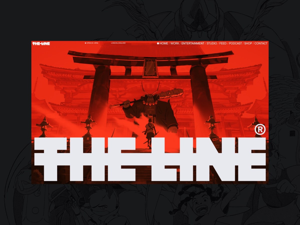
Web Design Inspiration
If you’re finding today a bit stressful for some reason, grab a respite by sinking into any of these web design inspiration websites.
-

The More Things Change… (or: What’s in a Job Title?)
I’m designing for the web. The infinitely flexible web.
-

Rediscovering music
If Spotify exposes you to new music, Last.fm helps remind you of great music in your existing collection that may have slipped your mind.
-
Saving Your Web Workflows with Prototyping
Our static tools and linear workflows aren’t the right fit for the flexible, diverse reality of today’s Web. Making prototyping a central element of your workflows will radically change how you approach problem solution and…
-
Digital newspaper design challenge: a report from Poynter, part 1
CAN design create a better user experience that engages readers and drives revenue? Can it fight fake news and help save real journalism at a time when news organizations large and small are underfinanced and…
-

To Save Real News
IN a world where newspapers are dying and half the public believes fake news, what online news experiences need is design that is branded, authoritative, and above all, readable: Branded, because we need to convert…
-
Grid Layout & Flexbox City
CSS GRID LAYOUT is nearly finalized. Which means it’s time for designers and front-end developers to set the flags enabling their browsers to support the new specification, put CSS Flexbox through its paces, and see…
-
CSS Grid Layout with Rachel Andrew: Big Web Show
RACHEL ANDREW—longtime web developer and web standards champion, co-founder of the Perch CMS, and author of Get Ready For CSS Grid Layout—is my guest on today’s Big Web Show. We discuss working with CSS Grid…
-
Big Web Show ? 132: Modern Layouts with Jen Simmons
THE BIG WEB SHOW is back from its break. My guest this week is Jen Simmons (@jensimmons) of The Web Ahead. We discuss moving beyond cookie-cutter layouts on the web; the ins and outs of…
-
A List Apart Issue No. 367: Apple’s Vexing Viewport
In A List Apart Issue No. 367, Peter-Paul Koch, Lyza Danger Gardner, Luke Wroblewski, and Stephanie Rieger explain why Apple’s new iPad Mini creates a vexing situation for designers and developers who create flexible, multi-device…
-
Web Design Manifesto 2012
THANK YOU for the screen shot. I was actually already aware that the type on my site is big. I designed it that way. And while I’m grateful for your kind desire to help me,…
-
Fluid grids, orientation & resolution independence
IF YOU’VE spent any time building responsive websites with fluid grids, you will have encountered the shock of seeing your beautiful portrait layout distort when viewed in landscape mode (or vice-versa.) This happens because whilst…
-
A List Apart: Responsive Images: How they Almost Worked and What We Need
RESPONSIVE WEB DESIGNERS, don’t miss Mat Marquis’ essential article in today’s A LIST APART, for people who make websites: Responsive Images: How they Almost Worked and What We Need. Mat shows why responsive images as…
-
Boston Globe’s Responsive Redesign. Discuss.
AS EVERY WEB DESIGNER not living under a rock hopefully already knows, The Boston Globe has had a responsive redesign at the hands of some of today’s best designers and developers: The spare Globe website…