Categories
AI State of the Web The Essentials Web Design History Web Standards

Receipts: a brief history of the death of the web.

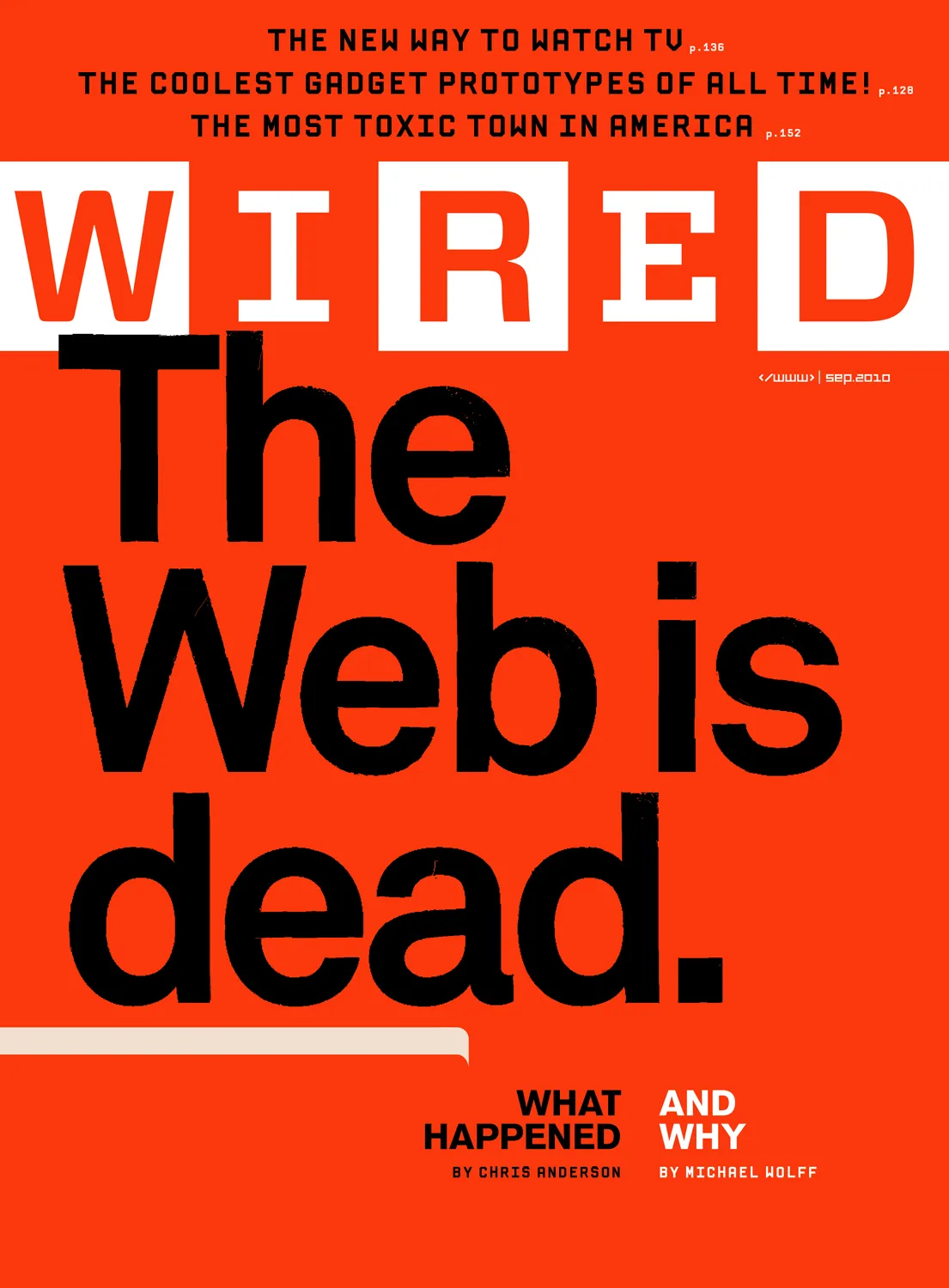
They say AI will replace the web as we know it, and this time they mean it. Here follows a short list of previous times they also meant it, starting way back in 1997.

Wired: March 1, 1997: “You can kiss your web browser goodbye” – Kevin Kelly and Gary Wolf, The Big Story.

Inspired by the success of PointCast, a clever application that displayed news headlines as a screensaver, our “Push!” story argued that Web browsers were about to become obsolete. 

(I repeat, this was 1997. The Wayback machine was roughly one year old. Primitive CSS was newly available in IE3, but most folks at the time continued to use the Netscape browser, which they bought on disc at their neighborhood computing store.)

Wired: May 1, 2004: “The Return of Push!” – Gary Wolf

Though I dubbed it “the worst story Wired ever published,” I quickly began to get feedback from readers who argued that the predictions in the piece were coming true after all. The inspiring technology this time is RSS, a specification that allows easy syndication of news, blogs, and other frequently updated sources.

There is a clear parallel between the excitement of the PointCast days and the enthusiasm for RSS today, one that goes further than easy harvesting of news headlines. Search engine results, product information, new music, notification of recent blog comments, and many other types of digital information are becoming available through RSS. This dialect of XML brings us the Web as an evolving environment: customizable, variable in intensity, and always on. This is the old promise of push. We can see the potential for radically new types of media – again.

To be fair, whereas the 1997 story made mountains out of an early “push” app, this 2004 second attempt to declare the web dead caught a moment of genuine game change as RSS, Atom, and XML provided dependable web standards (not a lone application, as in the 1997 piece) for syndication.

But syndication, of course, did not kill the web; it brought forward much of its inherent value. All praise to Dave Winer and his confederates for RSS and Atom, and to WaSP member Tim Bray and his colleagues for XML: here’s a contemporary history of how that standard came to be.

You’d think Wired would be tired (see what I did there?) of hyping the end of the platform that gave the magazine its relevance, but no:

Wired: August 17, 2018: “The Web Is Dead. Long Live the Internet.” – Chris Anderson and Michael Wolff, The Big Story.

Two decades after its inception, the World Wide Web has been eclipsed by Skype, Netflix, peer-to-peer, and a quarter-million other apps.

(Observation: A Wolf wrote or co-wrote the first two articles, and a Woolf co-wrote the third. A meaningless coincidence, but if this were politics instead of tech, there would doubtless be a whole QAnon-style conspiracy theory about it. Especially since Woolf is often a Jewish surname. But I digress.)

The web profoundly changed the world, for better and worse, with the jury still out on some charges, but one thing hasn’t changed: every few years someone in an intellectual leadership position declares the web kaput. It survived previous bubbles (starting with the dot-com crash) and has proved hardy enough to continue providing profound benefits and hazards to the entire world, absorbing and deepening new technologies rather than succumbing to them.

Look, I understand why AI is bigger than Pointcast and how it is disrupting anything it can be stuck in, but the web is not going away. ’Cause think about it for five minutes, which is four and a half minutes longer than the authors of the previous hype cycles appear to have done. If AI kills the web that provides the information AI sucks down, then there is no contemporary body of news and text for AI to suck down and regurgitate. It would be like a parasite that kills the host body. There are occasionally such things in nature, but mostly, life finds a way, mostly. And so will the web. Now a word about those self-driving cars….

Categories
A List Apart Accessibility Authoring Best practices CSS Design development HTML interface IXD Layout Markup Real type on the web Responsive Web Design Site Optimization Standards State of the Web The Essentials type Typography Usability User Experience UX W3C Web Design Web Design History Web Standards webtype

Web typography: a refresher and history

Many designers still think in px first when creating baseline styles. But we know intellectually that various relative typography approaches are better suited to our medium in all its complexity. Better for accessibility. Better for avoiding bizarre typographic disasters linked to user preference settings, device limitations, and the unforeseen ways our overwrought styles can interact with one another.

As I contemplate a long-overdue redesign of my own site, it’s worth taking a refreshing dip into what we’ve learned about web typography over the past 20+ years. From the pages of (where else?) A List Apart:

Bojan Mihelac: “Power to the People: Relative Font Sizes” (2004)

An early and simple creative solution for text resizing that respects users’ choices and also gives them an additional option for resizing despite the limitations of some of the most popular browsers of the day. Presented for its historical importance, and not as a how-to for today. https://alistapart.com/article/relafont/

Lawrence Carvalho & Christian Heilmann: “Text-Resize Detection” (2006)

Detect your visitors’ initial font size setting, and find out when they increase or decrease the font size. With this knowledge, you can create a set of stylesheets that adapt your pages to the users’ chosen font sizes, preventing overlapping elements and other usability and design disasters. Presented for its historical importance as an insight into the complex dancing we’ve done in the past to ensure readability. https://alistapart.com/article/fontresizing/

Richard Rutter: “How to Size Text in CSS“ (2007)

Sizing text and line-height in ems, with a percentage specified on the body (and an optional caveat for Safari 2), provides accurate, resizable text across all browsers in common use today. An early move toward more responsive type and away from the accessibility problems created by setting text sizes in px in some browsers and devices. https://alistapart.com/article/howtosizetextincss/

Wilson Miner: Setting Type on the Web to a Baseline Grid

The main principle of the baseline grid is that the bottom of every line of text (the baseline) falls on a vertical grid set in even increments all the way down the page. The magical end result is that all the text on your page lines up across all the columns, creating a harmonious vertical rhythm. https://alistapart.com/article/settingtypeontheweb/

Tim Brown: “More Meaningful Typography” (2011)

Introduces modular scales, the golden ratio of readable typography. Delivers accessibility plus aesthetic beauty derived from the math underlying all of creation. https://alistapart.com/article/more-meaningful-typography/

Tim Brown: “What is Typesetting?” (2018)

“We must now practice a universal typography that strives to work for everyone. To start, we need to acknowledge that typography is multidimensionalrelative to each reader, and unequivocally optional.” https://alistapart.com/article/flexible-typesetting/

Keep going…

For more web design community wisdom and web typography history, see Typography & Web Fonts in A List Apart, for people who make websites.

And in the Comments below, please share your favorite resources for creating websites that look great and read beautifully, no matter what technical and human capabilities get thrown at them.

Categories
"Digital Curation" Applications Archiving Blogs and Blogging conferences content Design dreams Election engagement glamorous industry iphone Microblogging Micropublishing Mobile Networks Platforms social media social networking Standards State of the Web SXSW The Essentials The Old Man of the Mountain tweets Web Design Web Design History Websites writing

Valediction.

I started using Twitter before the dawn of the iPhone. Back then, in 2006, it was a fun, funky, fully functional (if barebones) beta messaging service used mainly by The People of the Web™—the kind of folks who attended the SXSW Interactive conference and probably spoke on the panels. 

You know. You were there. You were one of us: Designers. Developers. Pioneers. Writers of blog posts, trade books, and all the little guide texts that websites depended on to attract and serve their users. People who, in casual conversation, might use words like “digerati” unironically and without intending to be pretentious. 

We believed in the power of the web to highlight unheard voices and evolve a more just society. If we were naive, and we surely were, at least we were on the side of the angels. Turns out, not everybody was.

A new skill

Years before Slack, the early 140-character Twitter served as a kind of private pre-Slack for the digitally awake and aware.

Back in those days, if you’d asked me or my conference-going fellow bloggers and designers who that first, rudimentary Twitter was for, we’d have said it was for us. For people like us, who’d spent years mastering all manner of skills and technologies simply to communicate online. Who saw value in the act of putting words together, so long as there were people to read and react to those words.

(After expressing our feelings of pride and ownership in the Twitter community, of course, the more Ted-talk-y among us early users would have waxed rhapsodic about microblogging and its potential to improve the world. More about that in a moment.)

With the birth of Twitter, when we wanted to pin down something that was twitching about in our heads and transmit it to other heads, the skill we needed wasn’t CSS or HTML or art direction or back-end wrangling. It was the ability to edit our thoughts down to a glittering trophy built with 140 characters or less. A new skill to master!

How much do people like us love showing the world what we’ve learned! This much: Even after Twitter no longer relied on wireless carriers’ text messaging services, so that the permitted character count was consequently doubled, many of us would-be Oscar Wildes continued to whittle away at our tweets, limiting them to 140 characters or fewer on principle.

After all, if we could deliver fully functioning website in 10K or less, we could surely craft deathless sentences from a tightly constrained character count. Right? Of course right!

Only connect

Years later, with a huge international user base, the idea persisted that a globally connected free and open messaging network like Twitter could help humanity do less evil and more good.

If you wanted proof, you could look to the first Arab Spring, to Me Too, to Occupy Wall Street and Black Lives Matter—movements that were greatly abetted by the busy, worldwide network. 

Of course, while many cheered and participated in these activist-driven movements, others saw them as threatening. Some felt the world was changing too fast, and that their views on social issues, like their once-good jobs, had no champion among the ruling classes. We all know how that turned out. 

And now a brief digression about power and megaphones:

How I got over

Nearly two decades before Bluesky and its sweet starter packs, Twitter hired creatives to recommend selected  users to newcomers. Some of the coolest people I know did that work.

Web design was at its peak, so quite naturally the in-house team put together a list of influential designers, developers, and writers for new users to follow. And for a variety of reasons, I was among those early recommended follows. (I may still be listed there, if the current X still welcomes newcomers with follow recommendations.) Which is how, at my Twitter peak, I ended up with a blue checkmark and 355,000 followers.

Even now, on wretched “X,” where I no longer post, I still retain 305,000 followers. At least, that’s what the stats told me when I popped in just now to find out. But are there really that many folks following me there?

How many of my current Twitter/X “followers” used to participate but have since quit quietly, without bothering to close their accounts? Lots, I reckon.

Some may avoid the site but keep their accounts open for strategic reasons, such as preventing someone else from hijacking their name (not that the owner can’t take over your account whenever he feels like it—but I digress).

Mainly, I’m guessing a lot of folks lost interest in the site but forgot to close their accounts. In other words, the data says 305K, but it’s probably less than half that many active users at most, few of whom would even see my tweets if I still posted there, as the algorithm throttles texts from folks like me.

Who cares, besides me? Nobody. Nor should they. And, besides, except as a temptation to stay, my follower count is beside the point.

Come play with us, Danny

The point is that the former Twitter has become a hateful cesspool, not simply mirroring but amplifying its owner’s profound insecurities, god-awful beliefs, and self-serving lies, and forcing that insanity into the public consciousness, whether we avoid X or not.

Thus, millions of Americans who don’t use Twitter/X nevertheless believe conspiracies that the owner and his favorite acolytes use the site to broadcast.

And there’s no doubt that, in consequence of the above, X helped determine the results of the last US presidential election. (I use the phrase “last election” here to mean “most recent election,” although I fear it may come to mean more than that.)

So, in the interest of not supporting fascism, do I abandon these readers? Thanks for asking! Pretty much, yeah.

If you like my longer-form writing, you can find it here on zeldman.com, at A List Apart, and in my books.

If you like my chatty posts, news bytes, and occasional brief confessions, join me on Bluesky.

Good luck to us all in the coming year.

Categories
37signals A Book Apart A List Apart Acclaim Adobe An Event Apart books Brands business Career Collectibles Community conferences content Coudal Partners Deck, the Designers E-Books editorial eric meyer Ethan Marcotte Free Advice glamorous Grief Happy Cog™ HTML5 Indieweb industry Jason Santa Maria Jeremy Keith launches Mentoring My Back Pages New York City NYC Products Publications Publisher's Note Publishing Responsibility Responsive Web Design San Francisco Small Business speaking State of the Web Surviving The Essentials The Profession This never happens to Gruber Typekit User Experience UX Wah! Web Design Web Design History Websites Wit and Wisdom Working writing zeldman.com

Of Books and Conferences Past

Some of A Book Apart’s 50-odd primary paperbacks, arranged like a color spectrum, and photographed against a piece of wood.

Just as nobody who marries spends their wedding day planning their divorce, almost nobody starts a business contemplating what rocks it will eventually splinter and break upon, and how to build a life raft for themselves.

I take that back. Some folks I know, who played pivotal roles in the evolution of the web, actually started their businesses with a clear goal of selling them to somebody bigger. Like Typekit was designed to sell to Adobe. Or Blogger was designed to sell to Google.

Such folks, several of whom are now post-economy wealthy, lived in the Bay Area in the 1990s and early 2000s, where building to flip was widely discussed and accepted.

Meanwhile, in NYC…

I, on the other hand, live in New York. So I started my web businesses (like Happy Cog™ design studio) to serve clients, as NYC creatives have always done, and with no understanding that I would one day need to leave the company and should have an exit plan. Why would I exit? Why would I ever stop doing work that brought excitement and meaning to my life?

Similarly, I started my personal site with its “Ask Dr. Web” tutorials in 1995, and co-founded my web design publication, A List Apart, in 1997, for the sheer joy of sharing knowledge, with no concept of making money, let alone of one day selling the business.

Eventually, despite my naivete, and mostly thanks to Jim Coudal and Jason Fried, A List Apart began making money by running one carefully screened ad per page. I used that money, as you will expect, to pay our writers, editors, and producers. And when it came time to stop running ads, I slowed our publication schedule, paid writers out of my own pocket, and worked with a small crew of fellow volunteers, who published ALA because we believed in the mission. (Still do.)

If I had come of business age in San Francisco, I likely would have sold A List Apart to somebody like O’Reilly, but that was never my plan because I make toys to play with, not to give away.

An ecosystem apart

In spite of A List Apart’s running at a loss, in the early 2010s I co-founded two businesses that spun out of it: An Event Apart design conference with Eric Meyer, and A Book Apart with Mandy Brown (later replaced by CEO Katel LeDu) and Jason Santa Maria. And during those first years, business was great.

We published HTML5 For Web Designers the day after Steve Jobs, waving an iPhone on the world’s biggest stage (okay, sitting at his desk), announced that Flash was dead because HTML5 would bring app-like dynamism to the web using open standards instead of proprietary code. It (our first book, I mean) sold brilliantly. “Gee, publishing isn’t that hard” I naively told myself. (No, I knew it was hard. My favorite publishers had been laying off my favorite editors for ten years before my partners and I took the plunge. But the early success did make me think the books we published about web design would always find a large, eager audience. In time, I would learn otherwise.)

And while we began the publishing house by relying on the best writers we knew personally to write about the topics they were most passionate about, I’m proud to say that, as we went along, we also discovered brilliant first-time book authors, helping them create perfectly polished, fluff-free manuscripts that made genuine contributions to our readers’ understanding of UX and all it entails. (And not just to our readers. The insights they brought to their work after digesting our books rubbed off on their colleagues.)

In giving these brilliant writers a platform, we not only helped them take their careers to the next level, we also helped people who create web content think and work better, which in turn helped the people who used the websites, applications, and products our readers designed and built. Of that, I am proud.

Stay hungry

An Event Apart (RIP) was also a damned fine early success. Web designers liked our innovation of a multi-day, single-track conference, with a holistic approach to web design, code, and content, and unifying themes between the individual talks. Our freaking-amazing speakers debuted Huge Ideas including Mobile First and Responsive Web Design—ideas which, like perfect contextual menus in UX, arrived at the very moment designers needed them.

Not only that, but these humble geniuses also sat in the auditorium with our audience for all three days of each conference event: listening to each other’s presentations, and updating their own presentations to better bounce off each other’s ideas and the evolving themes of that particular show. 

I could spend hours telling you how our producer Toby M. made miracles happen at every show, or how person-in-charge Marci E. brought joy to our community. How many of our speakers became authors. How some “graduated” from An Event Apart as newcomers replaced them. How the diversity of our speaking line-up, which wasn’t terrific in 2008, improved greatly each year. (Not that we ever said, “We need another black speaker” or “We need a trans speaker” or what-have-you. Just that we learned to swim outside the pool we came from, and discover great talent everywhere.) Our speakers were also almost uniformly Just Nice Good People, which doesn’t always happen when you’re collecting the greatest minds in an industry. 

That’s not even to mention the incredible people who attended our shows, some of whom became lifetime friends for me.

So why, given the joy these businesses brought to everyone connected to them, including me, would my partners and I have even conceived of an exit strategy? We wanted the Good Times to roll on forever.

But of course they never do.

Things end

COVID did in An Event Apart. Some conferences survived, of course. Different priorities, different overheads, different business models. Some that survived do not pay their speakers. Others, where the conference is an adjunct to a bigger business, laid off or reassigned conference staff while the pandemic made live events impossible. Others that survived mostly rely on volunteer labor, whereas we had paid staff. They were worth their weight in platinum, and we’d have paid them more (because they were worth more) if the pandemic and six-figure hotel contracts hadn’t made continuing the show impossible. My partner and I earned nothing during the business’s last five years, and got personally stuck with a six-figure debt when the event closed. It is what it is.

Although books should be COVID-proof, multiple financial problems eventually beset our publishing house as well. For most of the run of the business, my partner and I earned nothing beyond the glow of contributing to our community’s knowledge. We paid our CEO, authors, and editors, kept nothing for ourselves, and tried, oh how we tried, to keep the business going as its revenues tanked.

Speaking only for myself, I’ve learned that I am good at starting businesses and keeping them going creatively, as long as somebody else figures out the money. I suck at that, and I’m obsessed with the notions of fairness and self-sacrifice that were drummed into me by a narcissistic family that valued me for taking on the roles they were emotionally incapable of handling—such as bringing up my baby brother in my father’s absence, which no child is  equipped or should be asked to do, and yet it happens all the time. Growing up this way made me put my own self-interest last. Which is also why it never occurred to me to plan an exit. And by the time I needed to do so, the businesses were not in shape to sell.

Closing a conference is bad, but attendees can go to other conferences, and speakers can speak at other conferences; closing a conference doesn’t end a community. It sucks for the business but doesn’t strand participants.

But closing a publishing house hurts like hell, and you feel you let everybody down. I know how much our closing hurt some of our authors, and I think about that, instead of the good we achieved, when I look back. 

No doubt when my partner and I write the large personal checks to cover our deceased business’s outstanding debts, we’ll be regretting the harm our closing caused, not basking in the warm glow of how many careers we changed for the better. Like the standup comedian who obsesses about the guy who’s frowning at table 3, and doesn’t hear the laughter of the rest of the crowd. We also, hopefully, won’t focus too closely on our financial wreckage. Just pay the bill, and move on.

Anyway, I hadn’t publicly addressed the endings of these businesses, so I figured it was time to do so. I’m sharing my experience only. If you ask any of the people I worked with on these projects, they might have a different story to tell. And that would be their story, and it would be every bit as valid as anything I’ve said here.

I also didn’t ask permission of my partners, speakers, or authors before sharing these thoughts. Probably I should have. But, hey. As I’ve said. I’m speaking here only for myself.

So, anyway.

Parting gift

Is it worth the risk of starting a web-related business that isn’t a venture-backed startup? I still think it is, and I applaud all who try. Heck, I might even do so myself someday. If you’re doubtful because of (((gestures at everything))), it might be worth noting that I started Happy Cog™ during the dot-com crash, when studios were closing all around me. And we launched A Book Apart during the world financial crisis of late 2008. Don’t let (((all this))) deter you from trying something bold. Let me know when you do. I’ll keep watching the skies.

P.S. Under swell third-party ownership and management, Happy Cog is still going strong. Check it out!

Categories
A List Apart Blogs and Blogging business Career Community content copyright democracy editorial ethics glamorous Indieweb Internship My Back Pages Own your content Publications Publishing Responsibility Surviving The Essentials Web Design History Working writing

Ah yes, the famous “intern did it” syndrome

Soon after we launched A List Apart Magazine, we began to notice other websites reusing our content (including illustrations) without permission, and often without so much as a credit. As that violated our author’s copyrights and ours, we’d invariably reach out to the makers of those websites with brief, politely worded takedown requests. 

Not every content poacher was contactable, but those we did reach almost always quickly complied with our requests. They also nearly always claimed that an “intern” or “freelancer” had grabbed the content without their knowledge or permission. Some, perhaps fearing that we might be litigious, even went so far as to tell us that they’d “fired” the imaginary intern/freelancer the instant we informed them of the issue.

We always pretended to believe them.

Why? Because letting embarrassed people save face is kind. It also helps the whole interaction go more smoothly. Besides, the amateur pillager claiming “the intern did it” today may be your colleague or friend tomorrow.

I recalled this common awkwardness yesterday after a former US president who’s running for reelection blamed Nazi language in his social media post on a “staffer.” It would seem the buck stops anywhere but here.

Categories
Accessibility Adobe Advocacy AIGA art direction Authoring Bandwidth Best practices Browsers business Career client management Community creativity CSS Design Designers development Digital Preservation Fonts Future-Friendly HTML industry interface maturity Medium My Back Pages Off My Lawn! Performance Photoshop Rants Real type on the web Responsibility Responsive Web Design Site Optimization Standards State of the Web The Essentials The Profession Typography Usability User Experience UX Web Design Web Design History Web Standards Websites webtype work Working writing

This Web of Ours, Revisited

ONE MONTH and 24 years ago, in “Where Have All the Designers Gone?” (my HTMHell design column for Adobe of March 20, 2000), I discussed the deepening rift between aesthetically focused web designers and those primarily concerned with creating good experiences online:

More and more web designers seem less and less interested in web design.

Over the past 18 months or so, many of the best practitioners in the industry seem to have given up on the notion that a low-bandwidth, less than cutting-edge site is worth making. Much of the stuff they’ve been making instead has been beautiful and inspiring. But if top designers wash their hands of the rest of the Web, whose hands will build it, and whose minds will guide it? The possibilities are frightening.

An Imperfect Medium for Perfectionists

Why were many of the leading graphic designers and studios at the time uninterested in web design? For one thing, designers trained to strive for visual perfection found the web’s unpredictability depressing. The article provided clues to the frustrations of the time:

Good designers spend hours tweaking typography in Illustrator and Photoshop. Then visitors with slow connections turn off images.

Of course, where professionals trained in graphic design saw a distressing lack of control, others glimpsed in the infant technology a tremendous potential to help people, pixel-perfection be damned. To reduce the conflict to a cartoon, you might characterize it as David Carson versus Jakob Nielsen—though doing so would trivialize the concerns of both men. Designers already charged with creating websites found themselves somewhere in the middle—barking themselves hoarse reminding clients and managers that pixel-perfect rendering was not a thing on the web, while arguing with developers who told designers the exact same thing.

Visually inspiring websites like K10k showed that the web could, if approached carefully and joyfully, provide aesthetic delight. But many designers (along with organizations like AIGA) were unaware of those sites at the time.

Us and Them

Another source of tension in the medium in 2000 sprang from the discrepancy between the privileged access designers enjoyed—fast connections, up-to-date browsers and operating systems, high-res monitors (at least for the time) offering thousands of colors—versus the slow modems, aging and underpowered computers, outdated browsers, and limited-color monitors through which most people at the time experienced the web.

Which was the real design? The widescreen, multicolor, grid-based experience? Or the 216-color job with pixelated Windows type, a shallow “fold,” and pictures of headline text that took forever to be seen?

To view your masterpiece the way most users experienced it, and at the syrup-slow speed with which they experienced it, was to have an awakening or a nightmare—depending on your empathy quotient. Some designers began to take usability, accessibility, and performance seriously as part of their jobs; others fled for the predictability of more settled media (such as print).

A New (Old) Hope

My March, 2000 article ended on an upbeat note—and a gentle call to action:

For content sites to attain the credibility and usefulness of print magazines; for entertainment sites to truly entertain; for commerce sites and Web-based applications to function aesthetically as well as technically, the gifts of talented people are needed. We hope to see you among them.

That was my hope in 2000, and, all these years later, it remains my vision for this web of ours. For though the browsers, connections, and hardware have changed substantially over the past 24 years, and though the medium and its practitioners have, to a significant extent, grown the Hell up, beneath the surface, in 2024, many of these same attitudes and conflicts persist. We can do better.

Minus the framesets that formerly contained it, you may read the original text (complete with archaic instructions about 4.0 browsers and JavaScript that broke my heart, but which Adobe’s editors and producers insisted on posting) courtesy of the Wayback Machine.

☞  Hat tip to Andrey Taritsyn for digging up the article, which I had long forgotten.

Categories
AI automattic Blogs and Blogging content guestbook spam Indieweb industry Own your content software State of the Web Surviving The Essentials Websites

Akismet means never having to say you’re sorry

The wizards behind AI have been busy lately providing meaningful employment for digital nonpersons.

One of the hottest jobs for non-humans is crafting and deploying website guestbook spam. This market’s on fire!

If you thought the guestbook spam of yore was impressive, you ain’t seen nothing yet. The new, AI-assisted comment spam has improved keyword stuffing, fewer grammatical mistakes, and, best of all, there’s tons more of it. Your Comment section was never so useless!

And we’re not just talking quantity, here; we’re talking quality.

Compared to the spammers of yore, the new signal depressors have a bold confidence that proclaims, “Hello, world! I’m here to waste your time and extinguish what’s left of your hard-won reader community. Watch me work!”

Yes, the bots who shit in your sandbox are bigger, brassier, and better than ever at wasting your readers’ time and abusing your content to score points on the Google big board.

What’s that you say? You’re not a comment spam enthusiast?

In that case, do as I do: use Akismet to keep cruft where it belongs: off your website. Akismet was strong enough for the comment, form, and text spam of the past, and it’s strong enough for the new junk, too.

(Full disclosure: I work at Automattic, makers of Akismet, but I penned this post this morning purely as an Akismet customer, after happily reviewing the blocked comment spam on this here WordPress site of mine. Thanks, Akismet!)

Categories
Advocacy Best practices business Corporatism creativity ethics Ideas industry links Rants State of the Web The Essentials wealth work

Our Lady of Perpetual Profit

Corporations that take investors make an impossible promise to increase profits forever. Accordingly, they hire MBAs whose role is to juggle numbers to create ongoing, short-term profit. This juggling is frequently labeled “leadership.”

The juggling methods—abusing data, diminishing the primacy of the customer relationship, repeating what worked last year as if the demand for it will never end, and perpetually cutting costs—invariably remove value from the company. This, of course, results in more staff and cost cutting.

People who understand the customer and the product are ignored in favor of the number jugglers; research is disparaged in favor of a dogmatic relationship to data. 

The people who wreck the company get the big paychecks. Eventually a bigger company buys the first company, further destroying its value. The wreckers exit with more money, 1980s-corporate-raider-style. Skilled workers are laid off, quality plummets, and the cycle begins again. 

This picture of a business world with deeply misguided priorities—exemplified by horror stories from the worlds of tech, gaming, and entertainment—is brought to you by Doc Burford, whose discursive post, “the biggest threat facing your team, whether you’re a game developer or a tech founder or a CEO, is not what you think,” takes a while to get through, but is nonetheless worth reading.

It is not a picture of every company, to be sure. But it applies to many, and accounts for much of the worker unhappiness plus customer frustration that characterize this time and contribute to our political unrest.

I wrote this post so you’d know to check that one. Do it.

Categories
A Book Apart A Feed Apart A List Apart An Event Apart Applications architecture Best practices Career client services Community conferences creativity CSS Design Designers Education eric meyer experience Formats glamorous Happy Cog™ Ideas industry Information architecture launches links maturity Mentoring Networks people social media social networking software Standards State of the Web Stories Teaching The Essentials The Profession twitter User Experience UX Web Design Web Design History wisdom

“Where the people are”

It’s nearly twenty years ago, now, children. Facebook had only recently burst the bounds of Harvard Yard. Twitter had just slipped the bonds of the digital underground. But web geeks like me still saw “social media” as a continuation of the older digital networks, protocols, listservs, and discussion forums we’d come up using, and not as the profound disruption that, partnered with smartphones and faster cellular networks, they would soon turn out to be. 

So when world-renowned CSS genius Eric Meyer and I, his plodding Dr Watson, envisioned adding a digital discussion component to our live front-end web design conference events, our first thought had been to create a bespoke one. We had already worked with a partner to adapt a framework he’d built for another client, and were considering whether to continue along that path or forge a new one.

And then, one day, I was talking to Louis Rosenfeld—the Prometheus of information architecture and founder of Rosenfeld Media. I told Lou about the quest Eric and I were on, to enhance An Event Apart with a private social network, and shared a roadblock we’d hit. And Lou said something brilliant that day. Something that would never have occurred to me. He said: “Why not use Facebook? It already exists, and that’s where the people are.”

The habit of building

Reader, in all my previous years as a web designer, I had always built from scratch or worked with partners who did so. Perhaps, because I ran a small design agency and my mental framework was client services, the habit of building was ingrained. 

After all, a chief reason clients came to us was because they needed something we could create and they could not. I had a preference for bespoke because it was designed to solve specific problems, which was (and is) the design business model as well as the justification for the profession. 

Our community web design conference had a brand that tied into the brand of our community web design magazine (and soon-to-emerge community web design book publishing house). All my assumptions and biases were primed for discovery, design, development, and endless ongoing experiments and improvements.

Use something that was already out there? And not just something, but a clunky walled garden with an embarrassing origin story as a hot-or-not variant cobbled together by an angry, virginal undergraduate? The very idea set off all my self-protective alarms.

A lesson in humility

Fortunately, on that day, I allowed a strong, simple idea to penetrate my big, beautiful wall of assumptions.

Fortunately, I listened to Lou. And brought the idea to Eric, who agreed.

The story is a bit more complicated than what I’ve just shared. More voices and inputs contributed to the thinking; some development work was done, and a prototype bespoke community was rolled out for our attendees’ pleasure. But ultimately, we followed Lou’s advice, creating a Facebook group because that’s where the people were. 

We also used Twitter, during its glory days (which coincided with our conference’s). And Flickr. Because those places are where the people were. 

And when you think about it, if people already know how to use one platform, and have demonstrated a preference for doing so, it can be wasteful of their time (not to mention arrogant) to expect them to learn another platform, simply because that one bears your logo.

Intersecting planes of simple yet powerful ideas

Of course, there are valid reasons not to use corporate social networks. Just as there are valid reasons to only use open source or free software. Or to not eat animals. But those real issues are not the drivers of this particular story. 

This particular story is about a smart friend slicing through a Gordian Knot (aka my convoluted mental model, constructed as a result of, and justification for, how I earned a living), and providing me with a life lesson whose wisdom I continue to hold close.

It’s a lesson that intersects with other moments of enlightenment, such as “Don’t tell people who they are or how they should feel; listen and believe when they tell you.” Meet people where they are. It’s a fundamental principle of good UX design. Like pave the cowpaths. Which is really the same thing. We take these ideas for granted, now.

But once, and not so long ago, there was a time. Not one brief shining moment that was known as Camelot. But a time when media was no longer one-to-many, and not yet many-to-many. A time when it was still possible for designers like me to think we knew best. 

I’m glad a friend knew better.

Afterword

I started telling this story to explain why I find myself posting, sometimes redundantly, to multiple social networks—including one that feels increasingly like Mordor. 

I go to them—even the one that breaks my heart—because, in this moment, they are where the people are. 

Of course, as often happens, when I begin to tell a story that I think is about one thing, I discover that it’s about something else entirely.

Categories
"Digital Curation" Advocacy Applications apps automattic Blogroll Blogs and Blogging Brands Community content ethics glamorous Ideas Indieweb industry interface links Microauthoring Microblogging Micropublishing Networks Off My Lawn! Own your content Platforms Publications Publishing Rants social media social networking software State of the Web The Essentials twitter Usability User Experience UX Web Design History Websites Weird writing

In search of a digital town square

Ever since an infantile fascist billionaire (hereafter, the IFB) decided to turn Twitter over to the racially hostile anti-science set, folks who previously used that network daily to discuss and amplify topics they cared about have either given up on the very premise of a shared digital commons, continued to post to Twitter while holding their noses, or sought a new digital place to call their own. This post is for the seekers, to compare notes. 

These are my personal observations; your views may differ (and that’s more than okay). In this quick survey, I’m omitting specialty platforms like Tribel, Post, and Substack. Feel free to comment, if you like.

The platforms

BlueSky: The most beautifully elegant web interface. Also the best features (other than omission of hashtags). What Twitter should have become. I joined late—Jack didn’t invite me, likely a sign that I was no longer industrially relevant. I have few followers there, and my posts so far get little traction, but that could change. It’s so pretty (and the few friends that use it matter so much to me) that I keep using it, and I reserve judgement as to its future potential. https://bsky.app/profile/zeldman.bsky.social

Threads: Currently my primary alternative to Twitter, and the only place besides Twitter where my posts get at least some response. Not as visually refined as BlueSky, and with a curiously restricted single-hashtag-only policy. Although this editorial decision helps focus the mind, and likely also cuts down on spam, it interferes with amplifying multidimensional posts. But I digress.

Rough edges and restrictive tagging aside, Threads feels like the place that’s likeliest to inherit the mantle of default town square—if any social platform can do that in these new times, that is.

Threads got its huge jump start because, while the IFB was busy finding new ways to make Twitter less useful and more dangerous, Meta leveraged its huge installed Instagram base to give users a more or less instant social network hookup. If it’s easy, and comes with a built-in network of people I already follow, it wins—at least initially.

Meta may also blow their opportunity if they pursue misguided policies, such as impeding (by algorithmic fiat) “political speech” when democracies hang in the balance, regional wars threaten to become world wars, and the climate crisis is approaching a point of no return. https://www.threads.net/@zeldman

Mastodon: How do you decentralize a digital town square? Provide universal social connection without locking in participants? Mastodon (and federation generally) are an attempt to do those things.

These are important and noble goals, but Mastodon (and federation generally) are a long shot at replacing a primary walled garden like Twitter because they require a fair degree of geekery to set up, and the price tag of mass acceptance is ease of setup. (Compare Threads—easy set-up, built-in friends and followers if you already use Instagram—versus the learning curve with Mastodon.)

If BlueSky is MacOS and Threads is Windows, Mastodon is Linux: a great choice for techies, but likely too steep a hill for Ma and Pa Normie. A techie friend invited me to join, and I write there frequently, but, for whatever it’s worth, my Mastodon posts get very little in the way of responses. It is, nonetheless, a highly effective network for most who use it. https://front-end.social/@zeldman

Tumblr: A bit o’ the OG weird wacky wonderful web, and a special place for nonconformist creative types. By its nature, and the nature of its fiercely loyal users, it is a cult jam. I was an early and enthusiastic Tumblr fan, but it was never my main axe, probably because, since the dawn of time itself, I have had zeldman.com.

For a while, when the IFB first started wrecking Twitter, an uptick in Tumblr usage suggested that the funky old network just might take over as the world’s town hall, but this hope was unrealistic, as Tumblr was never about being for everybody, and Tumblristas are mostly happy keeping the platform a home for self-selecting freaks, queers, and creatives.

I’ll note that Tumblr is part of the Automattic family, and I work at Automattic (just celebrated my fifth anniversary there!), but my opinions here are mine alone. BTW—in nearly 30 years of blogging, that’s the first time I’ve used that phrase. https://apartness.tumblr.com

LinkedIn: A comparatively safe social network with a huge network built up over years, hence a great place to share work-related news and ideas.

Some early Twitter adopters of my acquaintance—especially those who mainly write about work topics like UX—have made LinkedIn their primary social home. For most working folks, it is undoubtedly a place to post and amplify at least some of the content that matters to you. OTOH, it’s not a place where I’d share deep takes on CSS (that’s probably Mastodon), cosplay (Tumblr), or personal true confessions (one’s blog, Threads, Twitter before the IFB took over). https://www.linkedin.com/in/zeldman

Twitter itself: During its heyday, before the IFB, and when it was the only game in town, I loved going there to see what clever things my smartest friends were saying, post my own bon mots, and promote content that mattered to me.

I’ll limit my comments on Twitter’s current state to noting that I still post there, from stubbornness as well as habit, and primarily in the (increasingly forlorn) hope that the IFB will eventually tire of his toy, or of the ceaseless financial hemorrhage, and go away, leaving the site to rebirth itself as an open source project or under the care of new, non-fascist owners.

Though the algorithm punishes my posts, and though I’m continually appalled by the MAGA posts, Russian disinformation, racist/ misogynist/ anti-semitic spew, and Trumpian ego of the current owner, I shall, at least for now, continue to defend my tiny turf there.

8 responses to “In search of a digital town square”

  1. L. Jeffrey Zeldman Avatar

    Psst. Comments are back. This is a test.

  2. dusoft Avatar

    I follow you on Mastodon and even when usually don’t respond to bunch of posts, I can still appreciate people being there. Since I use RSS, I get to read your posts that way usually coming to your website.

  3. Zeldman on Web and Interaction Design Avatar

    It’s nearly twenty years ago, now, children. Facebook had only recently burst the bounds of Harvard Yard. Twitter had just slipped the bonds of the…

  4. […] In search of a digital town square – L. Jeffrey Zeldman, non l’ultimo dei fessi sul web, cerca di fare il punto sullo stato dell’arte del self publishing oggi; […]

  5. […] In search of a digital town square – L. Jeffrey Zeldman, talks about the state of the art on mantaining a presence on the web today, with the available tools. […]

  6. […] In search of a digital town square (Jeffrey Zeldman) […]

  7. Zeldman on Web and Interaction Design Avatar

    Bluesky introduces open-source, collaborative moderation for federated social media websites: Bluesky was created to put users and communities in control of their social spaces online.…

  8. Zeldman on Web and Interaction Design Avatar

    I’ve started a Bluesky list featuring some of the brilliant writers, designers, coders, editors, and others who’ve contributed to A List Apart “for people who…

To respond on your own website, enter the URL of your response which should contain a link to this post’s permalink URL. Your response will then appear (possibly after moderation) on this page. Want to update or remove your response? Update or delete your post and re-enter your post’s URL again. (Find out more about Webmentions.)

Mentions

  • Unknown's avatar 💬 Zeldman on Web and Interaction Design
  • Unknown's avatar 💬 Zeldman on Web and Interaction Design
  • Unknown's avatar 💬 Zeldman on Web and Interaction Design
Categories
Best practices creativity Design Products The Essentials

Knowledge Management for the win

Knowledge management (KM) is the process of organizing, creating, using, and sharing collective knowledge within an organization. 

Unlock and unblock

For companies, institutions, and projects struggling to become more efficient and productive—and who these days is not?—solid knowledge management can unlock productivity and unblock awareness of customer needs, awareness of unrecognized gaps, creativity, alignment, product improvements, and greater success. 

Conversely, lack of knowledge management—or half-hearted knowledge management that is incomplete and/or not widely shared—holds back any organization afflicted by it.

Most institutions, companies, and groups suffer from at least a partial lack of solid knowledge management. Fortunately, this is fixable by acknowledging the problem, understanding its sources, and addressing them in planned phases. Open source organizations can implement via iterative sprints, traditional companies via top-down project management.

The three main areas of knowledge management

The three main areas of knowledge management are:

  • Accumulating knowledge.
  • Storing knowledge.
  • Sharing knowledge.

Accumulating knowledge happens every time any member of a team achieves a task—or fails to achieve it and analyzes why.

Storing knowledge can be as team-limited as reminders I jot down in my personal Notes app (useful only to me), or widely shared. Shared is better.

Much of our knowledge resides in individual brains. Knowledge management enables it to be shared. Successful knowledge management enables everyone to find it.

Examples of successful knowledge management

Successful knowledge management includes maintaining information in a place where it is easy to access, such as a centrally located online handbook or field guide. Examples include the Automattic Employee Field Guide (limited, public version; a richer version is available to employees only), IBM Design Language, the BBC News Style Guide, A List Apart Style Guide, and the W3C documentation such as Mobile Accessibility at W3C. Those just getting started compiling an organizational field guide—or improving an existing one—may find Workable’s Sample Employee Handbook templates useful, whether or not you use their product.

Taking advantage of all the expertise within an organization is a great way to maximize its potential. Companies have a well of untapped knowledge within their workforce that is lying dormant or siloed to individual staff or departments.

With the proper management structures in place, this knowledge can be found, stored, and made accessible to the wider workforce, offering tangible business – Human Resources: Knowledge Management

Ponder this now, and either proactively agitate for it, or, at the very least, keep awareness of it on a sticky note that you can return to when a C-level executive asks why you or your team haven’t made as much progress, or worked as effectively and efficiently, as possible.

Knowledge management is the secret sauce that enables organizations staffed by smart people to unlock their full potential.

#

Read these next:

Categories
Best practices blogger Blogs and Blogging Community content Content First Content-First creativity editorial findability Free Advice Ideas Indieweb industry links Marketing Off My Lawn! Own your content Platforms Publications Publishing Search Standards State of the Web Teapot The Essentials The Profession Wah! writing

Algorithm & Blues

Examining last week’s Verge-vs-Sullivan “Google ruined the web” debate, author Elizabeth Tai writes:

I don’t know any class of user more abused by SEO and Google search than the writer. Whether they’re working for their bread [and] butter or are just writing for fun, writers have to write the way Google wants them to just to get seen.

I wrote extensively about this in Google’s Helpful Content Update isn’t kind to nicheless blogs and How I’m Healing from Algorithms where I said: “Algorithms are forcing us to create art that fits into a neat little box — their neat little box.”

So, despite Sullivan’s claims to the contrary, the Internet has sucked for me in the last 10 years. Not only because I was forced to create content in a way that pleases their many rules, but because I have to compete with SEO-optimized garbage fuelled by people with deep pockets and desires for deep pockets.

Is the Internet really broken?

For digital creators who prefer to contain multitudes, Tai finds hope in abandoning the algorithm game, and accepting a loss of clout, followers, and discoverability as the price of remaining true to your actual voice and interests:

However, this year, I regained more joy as a writer when I gave upon SEO and decided to become an imperfect gardener of my digital garden. So there’s hope for us yet.

As for folks who don’t spend their time macro-blogging—“ordinary people” who use rather than spend significant chunks of their day creating web content—Tai points out that this, statistically at least a more important issue than the fate and choices of the artists formerly known as digerati, remains unsolved, but with glimmers of partially solution-shaped indicators in the form of a re-emerging indieweb impulse:

Still, as much as I agree with The Verge’s conclusions, I feel that pointing fingers is useless. The bigger question is, How do we fix the Internet for the ordinary person?

The big wigs don’t seem to want to answer that question thoroughly, perhaps because there’s no big money in this, so people have been trying to find solutions on their own.

We have the Indieweb movement, the Fediverse like Mastodon and Substack rising to fill the gap. It’s a ragtag ecosystem humming beneath Google’s layer on the Internet. And I welcome its growth.

For more depth and fuller flavor, I encourage you to read the entirety of “Is the internet really broken?” on elizabethtai.com. (Then read her other writings, and follow her on our fractured social web.)


“The independent content creator refuses to die.” – this website, ca. 1996, and again in 2001, paraphrasing Frank Zappa paraphrasing Edgar Varese, obviously.

Hat tip: Simon Cox.

Categories
business Career client management client services clients Design experience glamorous industry IXD Microblogging Own your content project management The Essentials The Profession twitter UX Web Design Wit and Wisdom work

Design Kickoff Meetings

Posted here for posterity:

Design kickoff meetings are like first dates that prepare you for an exciting relationship with a person who doesn’t exist.

Categories
business Career Design Designers SVA Teaching The Essentials The Profession

On Teaching (plus Monday links)

TEACHING is a great way to find out what you know, and to connect with other human beings around a shared passion. It’s an energy exchange as well as an information one, and the energy and information flow both ways.

I’ve been a faculty member in the MFA in Interaction Design program at New York’s School of Visual Arts since my colleague Liz Danzico cofounded the program with Steven Heller in 2009. As with all programs and departments at School of Visual Arts, the MFA IXD  program is run by a faculty of busy, working professionals who teach one three-hour class per week, one semester per year.  It’s the kind of gig that doesn’t interfere with your full-time job, and even makes you better at it.

(Fun facts: In 1988, I moved back to New York, the city of my birth, specifically so my then-girlfriend could study computer graphics at SVA; the highlight of my advertising career, which preceded my ascension into web and UX design, was spent working for top SVA advertising instructor Sal DeVito; and I subsequently enjoyed a long romantic relationship with an artist who’d moved to New York to study painting at SVA. So you could say that my eventually  teaching at the place was overdetermined. When Liz told me of her new program and invited me to teach in it, it was as if half the prior events in my life had been whispers from the future. But I digress.)

Helping students have better careers

Since the program began, I’ve taught a class called “Selling Design,” which helps students completing their Masters thesis  decide what kind of work they’d like to do when they leave with their MFA, a few months after the class begins. There are so many opportunities now for people who design experiences, digital or otherwise. What should they do? Where will they be happiest? Inside a big company or a small one? A product company or an agency/studio? Should they start their own business?

And there are so many kinds of workplaces. In some, it’s your work that matters most. In others, it’s politics. How can you tell the difference before taking a job? We illuminate the right questions to ask and the clues in a student’s own personality that can lead to a great career or a blocked one.

The main teaching method is discursive: I invite designers who’ve had interesting and varied careers to come into the studio and have a conversation in front of the class. Mainly I ask questions and the guest speaker answers; then the class asks questions. Over time the speakers’ experiences and the takeaways I synthesize from them for the class create a picture of everything from how to tell if someone’s lying to you in a job interview to the signs that you’ve come to the right place.

A blaze of glory

Photo of Alexis Lloyd. Head shot, dark background.

This Thursday, May 2nd, at 10:00 AM, I teach my last class of the year, and I’m thrilled that my guest speaker will be Alexis Lloyd, Head of Design Innovation at Automattic, and previously Chief Design Officer at Axios, and Creative Director of The New York Times R&D Lab. In my initial months at Automattic, I’ve reached out to Alexis many times for help and insight, and she’s always generous, patient, and illuminating. It will be an honor and a pleasure to end my teaching year in what will surely be a great conversation with this experienced design leader.

For more about the MFA IXD program at School of Visual Arts, follow @svaixd on Twitter and visit https://interactiondesign.sva.edu/ . And for those who don’t yet know Alexis, here are some points of reference:

And now for something completely different

This being Monday, here are some additional links for your pleasure, having nothing to do with the above:

Yeah, but can you dance to it?

Animators, find the musical beats for your animation. A Twitter mini-tutorial, with some usefully illuminating comments. (Hat tip: Val Head’s UI Animation Newsletter. Subscribe here: https://uianimationnewsletter.com/.)

From the same source, this cute Earth Day animation

Accessibility Insights

The “Top 5 Questions Asked in Accessibility Trainings,” by Carie Fisher of Deque, is a wonderful, inclusively written introduction to digital accessibility. From “what’s WCAG, even?” to why the “first rule of ARIA is: do not use ARIA” (use supported HTML elements instead), answers to just about all your questions may be found here. (Hat tip: David A Kennedy.)

And if you like that, Deque has plenty of other great accessibility articles, including a whole series by the great Glenda Sims.

Solve the Right Problem: Derek Featherstone on Designing for Extremes” is a two-minute read that tells the famous “map for the blind” story—one of my favorite UX parables ever (not to mention a great insight). Thanks to Michelle Langston for reminding me about this 2016 post.

A man cradles his newborn.

Everything means something to me

Every once in a while, life gifts you with a genuine moment. “>Here’s my friend designer/author Justin Dauer and his newborn, exchanging important information during, of all things, a business conference call. (By the way, Justin is now hard at work on the second edition of his book, Cultivating a Creative Culture, which I recommend for anyone leading a team: www.the-culturebook.com/.)

For your viewing pleasure…

Jen Simmons giving a lecture.

We’re standing at the threshold of an entirely new era in digital design—one in which, rather than hacking layouts together, we can actually describe layouts directly. The benefits will touch everything from prototyping to custom art direction to responsive design. In this visionary talk, rooted in years of practical experience, Jen Simmons shows you how to understand what’s different, learn to think through multiple stages of flexibility, and let go of pixel constraints forever.

Everything You Know About Web Design Just Changed” by Jen Simmons (60-minute video, captioned).

Categories
Best practices Content-First Fonts Ideas industry Medium Publications Publishing reportage Standards State of the Web studio.zeldman The Essentials The Profession Usability User Experience UX Web Design Zeldman

Authoritative, Readable, Branded: Report from Poynter Design Challenge, Part 2

Poynter style guide

THIS year’s Poynter Digital Newspaper Design Challenge was an attempt by several designers and pundits, working and thinking in parallel, to save real news via design. In Part 1 of my report from Poynter, I discussed the questions driving the challenge, and talked about the design work done in response to it by my colleagues Kat Downs Mulder, Mike Swartz, Lucie Lacava, and Jared Cocken. Here in Part 2, I’ll discuss my own work and the approach we took at my studio. But we begin with a quick look back at the past designs that brought us to this point:

Experiment 1: The Deck

During the past decade and a half, as both a publication designer and a publisher, I watched in horror as our publications became reader-hostile minefields of intrusive ads, overlays, and popups. The first thing I tried to do about this (besides removing the web equivalent of chart junk from my magazine) was to offer an alternative approach to advertising via The Deck, an ad network I cofounded with Jim Coudal of coudal.com and Jason Fried of Basecamp (formerly 37signals). The Deck permitted only one appropriately targeted ad per each page of content viewed. As primary instigator Jim Coudal put it:

A buy in The Deck reaches the creative community on the web in an uncluttered, controlled environment, far more valuable than a standard banner or a single text ad among dozens of others.

Jim, Jason, and I hoped that our cost-per-influence model would replace the CPM race to the bottom, and that our quasi-religious use of whitespace would be widely imitated by the smartest publications online.

But that didn’t happen. Advertising just got more intrusive. The Deck succeeded as a small business supporting a network of interesting small publications, but not at all as a primary influencer on the direction taken by advertising that supports web content.

Experiment 2: Readability

Then about seven years ago, my friend Rich Ziade and his engineers created Readability, an app that sat between you and the ugly site you were trying to read, the way screen readers sit between visual websites and blind web users. Readability grabbed an article page’s primary content, removed the junk, and replaced the cluttered and illegible layout with a clean, readable page inspired by the clarity of iBooks and Kindle, which were just taking off at the time.

Rich released Readability 1.0 as open source; Apple immediately absorbed it into the Safari browser, where it continues to provide Safari’s built-in “reader” mode. (Safari’s “reader” mode was Apple’s first step in decluttering the web and returning it to the people who use it; “content blocking” would be the second step.)

Moreover, Readability 2.0, released by Rich’s then-company Arc90 the following year, added automatic payment for content creators slash publishers, as I explained at the time to anyone who would listen. Had Readability been allowed to continue the experiment, content monetization might have been less of a problem than it is today, and publication brands (the notion that it matters who publishes what we read) would be in exactly the same pickle they’re in anyway—except that readers would get their news in Readability’s attractive and customizable format, instead of from Apple News, Facebook, and the like.

I used to go around the world on lecture tours, warning my fellow designers that if we didn’t figure out how to declutter and compellingly brand sites, apps like Readability would do it for us. I still go around on lecture tours, but I’ve moved on to other issues. As for Readability, it was killed by a digital lynch mob after one powerful blogger, misunderstanding the motivation behind it, issued the digerati equivalent of a fatw?. But that’s another story.

Experiment 3: Big Type Revolution

In 2012, inspired by Readability and frustrated by the industry’s determination to make ever less legible, ever more cluttered sites full of tracking and popups and everything except what readers need, I bet big on large type:

This redesign is a response to ebooks, to web type, to mobile, and to wonderful applications like Instapaper and Readability that address the problem of most websites’ pointlessly cluttered interfaces and content-hostile text layouts by actually removing the designer from the equation. (That’s not all these apps do, but it’s one benefit of using them, and it indicates how pathetic much of our web design is when our visitors increasingly turn to third party applications simply to read our sites’ content. It also suggests that those who don’t design for readers might soon not be designing for anyone.)

Writing in Forbes, Anthony Wing Kosner saw the future in my initially crude experiment:

If you want to know where the web is going, one clue is to look at the personal sites of top-tier web designers. And one trend that just bubbled to the surface is large body type—the kind you don’t have to command-plus to read.

Jeffrey Zeldman…made a particularly strong point about it in his “Web Design Manifesto 2012,” that he published yesterday.

Large Type: One Web Designer Puts Content First in a Big Way

Not to brag (okay, too late), but he wasn’t wrong. It was the future.

(Also, I’m fairly sure I wasn’t the only designer at the time who reacted against tiny type and cluttered anti-user layouts by stripping pages down to only their most necessary elements, and boosting the type size to enforce a more relaxed reading posture. The idea was in the air.)

The experiment becomes the norm

In any case, soon enough, readable (big type and plenty of whitespace) layouts starting popping up everywhere. At medium.com. In Mike Pick’s redesign of A List Apart. In article pages for The New York Times, Washington Post, Vox, Newsweek, The New Yorker, and, eventually, many other publications.

An uncluttered page focused on the reading experience (reminder: big type and plenty of whitespace) is now the default at several leading news publications. But many smaller publications, struggling just to survive, have not kept up. And so we have a perfect crisis:

Publications that do not encourage reading, loyalty, or repeat visits are struggling to survive at the very moment real news is under attack from an authoritarian president. What to do?


A two-up from the Poynter challenge

My response to the Poynter Design Challenge

There are many ways to respond to an existential crisis like the one facing most news publications. You can rethink the relationship between reader and publication. Rethink the job of the publication. Make news work more like a lifestyle app. Make it more immersive. My colleagues followed those paths out brilliantly (as described in Part 1).

But I went for the low-hanging fruit. The thing any publisher, no matter how cash-strapped, could do. The thing I had seen working since I started yelling about big type in 2012. I went for a clean, uncluttered, authoritative, branded page. Authoritative because this isn’t fake news. Branded because the source matters.

The easiest, fastest, most readily attainable path to clean, uncluttered, authoritative, branded design is through typography.


Sample reader layout from the Poynter challenge

Any publication can be readable

Any newspaper, however poor, can afford better typography. Any newspaper with a designer on staff can attain it, if the paper stops treating design as a lackey of marketing or editorial or advertising, and sets designers free to create great reading experiences.

In my work, which is still underway (and will continue for some time), I focused on creating what I call “reader” layouts (and probably other designers call them that too; but I just don’t know). Layouts that are branded, authoritative, clean, uncluttered, and easy to read.

I played with type hierarchies and created simple style guides. Most of my little pages began as Typecast templates that I customized. And then Noël Jackson from my studio cleaned up the HTML and CSS to make it more portable. We put the stuff up on GitHub for whoever wants to play with it.

These are only starting points. Any designer can create these kinds of layouts. There’s nothing special about what I did. You can do the same for your paper. (And if you can’t, you can hire us.)

The work I share here is the start of a project that will continue at our studio for a long time. for the win!

Additional reading