Category: Typography
-

Ebb, Meet Flow: Intrinsic Design in a Nutshell
In 2020, the gifted makers of websites at Clearleft shared methods to achieve fluid responsive design. “Utopian” web design was (and still is) their half-kidding name for this approach, which Apple’s Jen Simmons, working indendently,…
-
Web typography: a refresher and history
A refreshing dip into what we’ve learned about web typography over the past 20+ years.
-
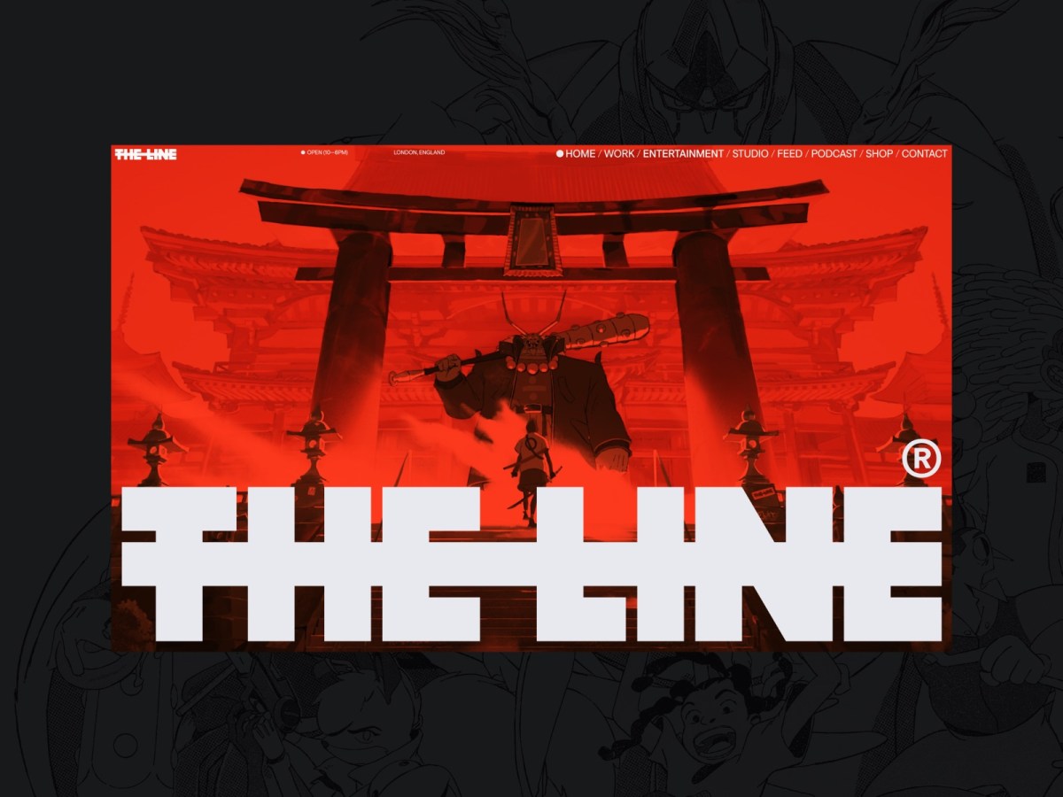
Web Design Inspiration
If you’re finding today a bit stressful for some reason, grab a respite by sinking into any of these web design inspiration websites.
-

This Web of Ours, Revisited
Why did leading designers in 2000 look down their nose at the web? And are things any better today?
-
Just add water.
Quick, before everyone else thinks of it. Set the word “SUCCESSION” in Engravers Gothic and export it to a transparent PNG. Download photos of confederate general Mitch McConnell and Republican Johns Thune (R-S.D.), Cornyn (R-Texas),…
-

Adelle Mono & Adelle Mono Flex
Adelle and Adelle Sans have long been two of my favorite fonts—two great tastes that taste even better together! Now there are two more great flavors, with the release of Veronika Burian and José Scaglione’s twin-powered Adelle Mono family.…
-
Web Performance Today
Front-end design/development then and now. As web design becomes more complicated, so do performance solutions. Enjoy a nostalgic look back at yesterday’s best practices, and dive into great resources for optimizing today’s complex websites and…
-
A Helvetica For Readers
A Helvetica For Readers: behind the site design for Robert Slimbach’s new Acumin type family—fresh at zeldman.com.
-
This Week In The Death of Publishing & The Web
FAST COMPANY writes: Apple, like Facebook, has entered into a standoff with the publishing industry and the open, if for-profit, web. And it’s being done under the aegis of design: choose a better reading experience…
-
From NYPL to DC Comics: the lettering of Ira Schnapp
HE DESIGNED the lettering on The New York Public Library and the James Farley Post Office (“neither snow nor rain…”), created titles for silent movies, movie posters, and pulp magazines in the 1920s, and started…
-
Webfonts with Stylistic Sets from Hoefler & Co.
Now there’s a way to transform your web typography at the touch of a button: introducing Stylistic Sets for webfonts at Cloud.typography. www.typography.com/blog/webfonts-with-stylistic-sets/
-
Big, Beautiful Dropcaps with CSS initial-letter
Just beautiful. demosthenes.info/blog/961/Big-Beautiful-DropCaps-with-CSS-initial-letter
-
The Practice
Typekit Practice is a fine new typography resource. Congrats & thanks @nicewebtype @typekit ! http://t.co/LncTpApUku pic.twitter.com/AVntKX6Ntn — Jeffrey Zeldman (@zeldman) April 18, 2014
-
Responsive Typography
“NOT EVERYTHING always works in your favor when you design for the screen. Interaction design is engineering: it’s not about finding the perfect design, it’s finding the best compromise.” Responsive Typography: The Basics | Information…
-
Web Design Manifesto 2012
THANK YOU for the screen shot. I was actually already aware that the type on my site is big. I designed it that way. And while I’m grateful for your kind desire to help me,…