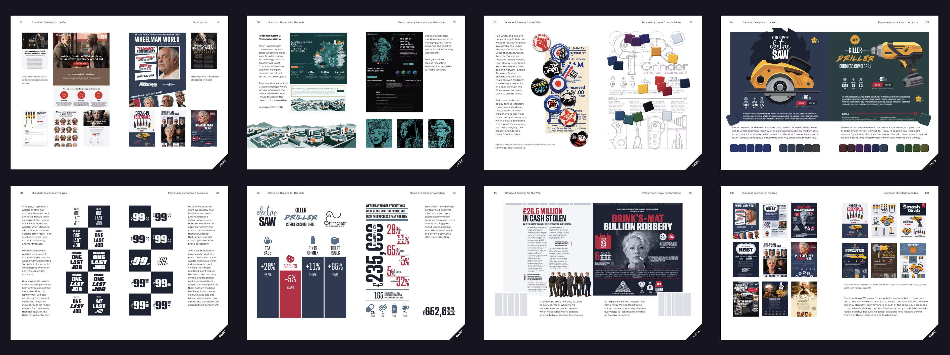
Andy Clarke’s Standout Designs for the Web ships Wednesday and is now available for pre-order. I had the honor of writing the Foreword, reprinted here:
Foreword
I first met British art director, writer, and illustrator Andy Clarke at the SXSW Interactive festival in Austin, Texas. At the time, SXSW was the number one destination for the loose community of bloggers, designers, standardistas and strategists who were then fiercely forging our modern web. Although our talents differed, I recognized Andy as my creative kin, and called him a “triple-talented bastard” to his face. Twenty years on, I stand by that remark. And so, apparently, does Andy, who still prints it in his bio. Which tells you two things: 1. He has a healthy ego. And 2. I can’t count. (He is at least quintuple-talented.)
Andy and I came up in the same corner of the web, the one that believed standards were a cause and design was a form of argument. Back then, we fought browsers to make pages look intentional and work for everyone. Today the browsers are brilliant and the tools are astonishing. Grid, variable fonts, even (dare I mention it?) generative AI: you can make almost anything, in almost no time.
So why does every website look like every other website?
You know the ones I mean. Swap the logo, trade the color palette, replace the hero photo, and the car insurance site becomes the ride-hailing app becomes the charity. Polished, professional, unremarkable, and interchangeable. We have never had better tools or made duller use of them.
Andy has had enough. You can hear it in this book, and thank God for it, because his irritation is productive. His argument here is simple and quietly radical: design is not assembling familiar components into familiar layouts. Design is deciding. Deciding what makes your client unlike anyone else, and having the nerve to show it. Patterns are tools, not templates. A company’s story, properly told, should make its website impossible to confuse with any other.
To prove it, he invents Wheelman, a digital magazine and service hub for getaway drivers. It’s a joke with real consequences: every design decision in the book plays out against this fictional client, and because Wheelman has personality to burn, you watch the ideas become pages. By the end, Andy’s case study has done what all case studies should do and most never do: entertain you while teaching you.
Andy finds his inspiration where he always has: punk fanzines and wrestling posters, Film Noir posters and magazine grids, anywhere someone made something memorable using fewer tools than we have today. He doesn’t ask how to make a website look like those things. He asks why they work, then carries the answer somewhere new. That habit of mind, more than any technique in these pages, is what he’s really teaching.
And a habit of mind—rather than a collection of soon-to-be-obsolete tips and tricks—is the best thing one designer can teach another. It’s the best thing to learn when you’re feeling restless, bored, disheartened, or burnt-out by the current web design scene. Just when we needed it most, this book contains medicine to inspire our creativity and restore our souls.
I’ve spent a frightening number of years working to make the web more usable, more accessible, more standard. I’d fight anyone who says that work was wrong. But somewhere along the way, a lot of us stopped making websites that could belong to no one else. Enter the triple-talented bastard with a text only he could create. This short book is a corrective, a joy, and a spur. Read it, then make something only you can make.
—Jeffrey Zeldman New York, November 2026