Tag: Design
-

The Secret
If I learned one thing in 25 years of running design and education companies, it’s that idealism isn’t a business strategy. If you wonder why my partners and I had to shut down organizations we…
-
Cold Storage
Good UX is what companies do when they have to. A company that has your stuff locked away doesn’t have to.
-
Behind every successful launch, there are 100 interesting failures.
We must stop thinking of failure as an end of something, and learn to see it as a natural part of progress. The first incarnation of a new idea may die, but the best ideas…
-
Staying relevant
“And in their place came acceptance.” Staying relevant in your profession as you age and technology changes.
-
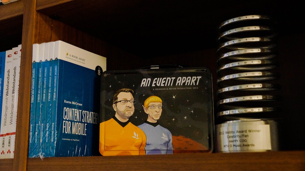
Of Books and Conferences Past
Of books and conferences past: A maker looks back on things well-made but no longer with us.
-
Web Design Inspiration
If you’re finding today a bit stressful for some reason, grab a respite by sinking into any of these web design inspiration websites.
-

For love of pixels
Stroll with us down memory lane as we celebrate the pearl anniversary of pixel art creation’s primary progenitor, and some of the many artists and design languages it inspired.
-

The More Things Change… (or: What’s in a Job Title?)
I’m designing for the web. The infinitely flexible web.
-
A faster horse
“The user is never wrong” means, when a user snags on a part of your UX that doesn’t work for her, she’s not making a mistake, she’s doing you a favor. To benefit from this…
-
My Liz Danzico Joke
I used to tell a joke I made up. An American goes to the Vatican on Easter Sunday, joining a huge crowd of worshippers who gaze up in awe at a raised platform. On the platform…
-
“A $44 billion version of MySpace.”
My longtime friend and former collaborative partner Craig Hockenberry bids a dignified adieu to Twitterific, Twitter, and his mom … and calls for a standards-based universal timeline. — The Shit Show
-
Looking Back, Looking Ahead: artist Dan Licht
In 1999, I had the good fortune to work alongside Dan Licht at an NYC digital startup called SenseNet, RIP. Back then, although still in his early 20s, Dan was already an accomplished art director and digital…
-
My Night With Essl
Herewith, a scene from last night’s interview with legendary web & book designer (and Dean of The Cooper Union School of Art) Mike Essl, who shared his portfolio, career highlights, early web design history, and…
-
Never give up
The really good designers stand up to the misfortune of a killed idea.
-

The Whims
One of my first professional jobs was at a tiny startup ad agency in Washington, DC. The owner was new to the business and made the mistake of hiring a college buddy as his creative…