Categories
Accessibility Adobe Advocacy AIGA art direction Authoring Bandwidth Best practices Browsers business Career client management Community creativity CSS Design Designers development Digital Preservation Fonts Future-Friendly HTML industry interface maturity Medium My Back Pages Off My Lawn! Performance Photoshop Rants Real type on the web Responsibility Responsive Web Design Site Optimization Standards State of the Web The Essentials The Profession Typography Usability User Experience UX Web Design Web Design History Web Standards Websites webtype work Working writing

This Web of Ours, Revisited

ONE MONTH and 24 years ago, in “Where Have All the Designers Gone?” (my HTMHell design column for Adobe of March 20, 2000), I discussed the deepening rift between aesthetically focused web designers and those primarily concerned with creating good experiences online:

More and more web designers seem less and less interested in web design.

Over the past 18 months or so, many of the best practitioners in the industry seem to have given up on the notion that a low-bandwidth, less than cutting-edge site is worth making. Much of the stuff they’ve been making instead has been beautiful and inspiring. But if top designers wash their hands of the rest of the Web, whose hands will build it, and whose minds will guide it? The possibilities are frightening.

An Imperfect Medium for Perfectionists

Why were many of the leading graphic designers and studios at the time uninterested in web design? For one thing, designers trained to strive for visual perfection found the web’s unpredictability depressing. The article provided clues to the frustrations of the time:

Good designers spend hours tweaking typography in Illustrator and Photoshop. Then visitors with slow connections turn off images.

Of course, where professionals trained in graphic design saw a distressing lack of control, others glimpsed in the infant technology a tremendous potential to help people, pixel-perfection be damned. To reduce the conflict to a cartoon, you might characterize it as David Carson versus Jakob Nielsen—though doing so would trivialize the concerns of both men. Designers already charged with creating websites found themselves somewhere in the middle—barking themselves hoarse reminding clients and managers that pixel-perfect rendering was not a thing on the web, while arguing with developers who told designers the exact same thing.

Visually inspiring websites like K10k showed that the web could, if approached carefully and joyfully, provide aesthetic delight. But many designers (along with organizations like AIGA) were unaware of those sites at the time.

Us and Them

Another source of tension in the medium in 2000 sprang from the discrepancy between the privileged access designers enjoyed—fast connections, up-to-date browsers and operating systems, high-res monitors (at least for the time) offering thousands of colors—versus the slow modems, aging and underpowered computers, outdated browsers, and limited-color monitors through which most people at the time experienced the web.

Which was the real design? The widescreen, multicolor, grid-based experience? Or the 216-color job with pixelated Windows type, a shallow “fold,” and pictures of headline text that took forever to be seen?

To view your masterpiece the way most users experienced it, and at the syrup-slow speed with which they experienced it, was to have an awakening or a nightmare—depending on your empathy quotient. Some designers began to take usability, accessibility, and performance seriously as part of their jobs; others fled for the predictability of more settled media (such as print).

A New (Old) Hope

My March, 2000 article ended on an upbeat note—and a gentle call to action:

For content sites to attain the credibility and usefulness of print magazines; for entertainment sites to truly entertain; for commerce sites and Web-based applications to function aesthetically as well as technically, the gifts of talented people are needed. We hope to see you among them.

That was my hope in 2000, and, all these years later, it remains my vision for this web of ours. For though the browsers, connections, and hardware have changed substantially over the past 24 years, and though the medium and its practitioners have, to a significant extent, grown the Hell up, beneath the surface, in 2024, many of these same attitudes and conflicts persist. We can do better.

Minus the framesets that formerly contained it, you may read the original text (complete with archaic instructions about 4.0 browsers and JavaScript that broke my heart, but which Adobe’s editors and producers insisted on posting) courtesy of the Wayback Machine.

☞  Hat tip to Andrey Taritsyn for digging up the article, which I had long forgotten.

Categories
Advocacy Best practices business Corporatism creativity ethics Ideas industry links Rants State of the Web The Essentials wealth work

Our Lady of Perpetual Profit

Corporations that take investors make an impossible promise to increase profits forever. Accordingly, they hire MBAs whose role is to juggle numbers to create ongoing, short-term profit. This juggling is frequently labeled “leadership.”

The juggling methods—abusing data, diminishing the primacy of the customer relationship, repeating what worked last year as if the demand for it will never end, and perpetually cutting costs—invariably remove value from the company. This, of course, results in more staff and cost cutting.

People who understand the customer and the product are ignored in favor of the number jugglers; research is disparaged in favor of a dogmatic relationship to data. 

The people who wreck the company get the big paychecks. Eventually a bigger company buys the first company, further destroying its value. The wreckers exit with more money, 1980s-corporate-raider-style. Skilled workers are laid off, quality plummets, and the cycle begins again. 

This picture of a business world with deeply misguided priorities—exemplified by horror stories from the worlds of tech, gaming, and entertainment—is brought to you by Doc Burford, whose discursive post, “the biggest threat facing your team, whether you’re a game developer or a tech founder or a CEO, is not what you think,” takes a while to get through, but is nonetheless worth reading.

It is not a picture of every company, to be sure. But it applies to many, and accounts for much of the worker unhappiness plus customer frustration that characterize this time and contribute to our political unrest.

I wrote this post so you’d know to check that one. Do it.

Categories
Accessibility Advocacy architecture Authoring Best practices development ethics industry Performance Platforms Responsibility Standards State of the Web Usability User Experience UX W3C Web Standards

CAPTCHA excludes disabled web users

What’s widely used, no longer particularly effective, and makes web content inaccessible to many people with disabilities? It’s our old friend CAPTCHA! In a group note dated 16 December 2021, the W3C explains how CAPTCHA excludes disabled users, and suggests alternatives which may be kinder and more reliable:

Various approaches have been employed over many years to distinguish human users of web sites from robots. The traditional CAPTCHA approach asking users to identify obscured text in an image remains common, but other approaches have emerged. All interactive approaches require users to perform a task believed to be relatively easy for humans but difficult for robots. Unfortunately the very nature of the interactive task inherently excludes many people with disabilities, resulting in a denial of service to these users. Research findings also indicate that many popular CAPTCHA techniques are no longer particularly effective or secure, further complicating the challenge of providing services secured from robotic intrusion yet accessible to people with disabilities. This document examines a number of approaches that allow systems to test for human users and the extent to which these approaches adequately accommodate people with disabilities, including recent non-interactive and tokenized approaches. We have grouped these approaches by two category classifications: Stand-Alone Approaches that can be deployed on a web host without engaging the services of unrelated third parties and Multi-Party Approaches that engage the services of an unrelated third party.

W3C: Inaccessibility of CAPTCHA: Alternatives to Visual Turing Tests on the Web

We can do better!

Tell your friends. Tell your boss. Tell your clients.

Tip o’ the blue beanie to Adrian Roselli.

Categories
Advocacy Announcements arts Best practices bugs content Content First editorial Education engagement Ideas industry Microblogging Off My Lawn! Press Publications Publisher's Note Publishing reportage Reporting Responsibility Standards Wit and Wisdom Working writing

Get it right.

“Led” is the past tense of “lead.”

L.E.D. Not L.E.A.D.

Example: “Fran, who leads the group, led the meeting.”

When professional publications get the small stuff wrong, it makes us less trusting about the big stuff. Trust in media is already at an all-time low. Don’t alienate liberal arts majors and obsessive compulsives. We may be the last readers standing.

Categories
"Digital Curation" Advocacy Applications apps automattic Blogroll Blogs and Blogging Brands Community content ethics glamorous Ideas Indieweb industry interface links Microauthoring Microblogging Micropublishing Networks Off My Lawn! Own your content Platforms Publications Publishing Rants social media social networking software State of the Web The Essentials twitter Usability User Experience UX Web Design History Websites Weird writing

In search of a digital town square

Ever since an infantile fascist billionaire (hereafter, the IFB) decided to turn Twitter over to the racially hostile anti-science set, folks who previously used that network daily to discuss and amplify topics they cared about have either given up on the very premise of a shared digital commons, continued to post to Twitter while holding their noses, or sought a new digital place to call their own. This post is for the seekers, to compare notes. 

These are my personal observations; your views may differ (and that’s more than okay). In this quick survey, I’m omitting specialty platforms like Tribel, Post, and Substack. Feel free to comment, if you like.

The platforms

BlueSky: The most beautifully elegant web interface. Also the best features (other than omission of hashtags). What Twitter should have become. I joined late—Jack didn’t invite me, likely a sign that I was no longer industrially relevant. I have few followers there, and my posts so far get little traction, but that could change. It’s so pretty (and the few friends that use it matter so much to me) that I keep using it, and I reserve judgement as to its future potential. https://bsky.app/profile/zeldman.bsky.social

Threads: Currently my primary alternative to Twitter, and the only place besides Twitter where my posts get at least some response. Not as visually refined as BlueSky, and with a curiously restricted single-hashtag-only policy. Although this editorial decision helps focus the mind, and likely also cuts down on spam, it interferes with amplifying multidimensional posts. But I digress.

Rough edges and restrictive tagging aside, Threads feels like the place that’s likeliest to inherit the mantle of default town square—if any social platform can do that in these new times, that is.

Threads got its huge jump start because, while the IFB was busy finding new ways to make Twitter less useful and more dangerous, Meta leveraged its huge installed Instagram base to give users a more or less instant social network hookup. If it’s easy, and comes with a built-in network of people I already follow, it wins—at least initially.

Meta may also blow their opportunity if they pursue misguided policies, such as impeding (by algorithmic fiat) “political speech” when democracies hang in the balance, regional wars threaten to become world wars, and the climate crisis is approaching a point of no return. https://www.threads.net/@zeldman

Mastodon: How do you decentralize a digital town square? Provide universal social connection without locking in participants? Mastodon (and federation generally) are an attempt to do those things.

These are important and noble goals, but Mastodon (and federation generally) are a long shot at replacing a primary walled garden like Twitter because they require a fair degree of geekery to set up, and the price tag of mass acceptance is ease of setup. (Compare Threads—easy set-up, built-in friends and followers if you already use Instagram—versus the learning curve with Mastodon.)

If BlueSky is MacOS and Threads is Windows, Mastodon is Linux: a great choice for techies, but likely too steep a hill for Ma and Pa Normie. A techie friend invited me to join, and I write there frequently, but, for whatever it’s worth, my Mastodon posts get very little in the way of responses. It is, nonetheless, a highly effective network for most who use it. https://front-end.social/@zeldman

Tumblr: A bit o’ the OG weird wacky wonderful web, and a special place for nonconformist creative types. By its nature, and the nature of its fiercely loyal users, it is a cult jam. I was an early and enthusiastic Tumblr fan, but it was never my main axe, probably because, since the dawn of time itself, I have had zeldman.com.

For a while, when the IFB first started wrecking Twitter, an uptick in Tumblr usage suggested that the funky old network just might take over as the world’s town hall, but this hope was unrealistic, as Tumblr was never about being for everybody, and Tumblristas are mostly happy keeping the platform a home for self-selecting freaks, queers, and creatives.

I’ll note that Tumblr is part of the Automattic family, and I work at Automattic (just celebrated my fifth anniversary there!), but my opinions here are mine alone. BTW—in nearly 30 years of blogging, that’s the first time I’ve used that phrase. https://apartness.tumblr.com

LinkedIn: A comparatively safe social network with a huge network built up over years, hence a great place to share work-related news and ideas.

Some early Twitter adopters of my acquaintance—especially those who mainly write about work topics like UX—have made LinkedIn their primary social home. For most working folks, it is undoubtedly a place to post and amplify at least some of the content that matters to you. OTOH, it’s not a place where I’d share deep takes on CSS (that’s probably Mastodon), cosplay (Tumblr), or personal true confessions (one’s blog, Threads, Twitter before the IFB took over). https://www.linkedin.com/in/zeldman

Twitter itself: During its heyday, before the IFB, and when it was the only game in town, I loved going there to see what clever things my smartest friends were saying, post my own bon mots, and promote content that mattered to me.

I’ll limit my comments on Twitter’s current state to noting that I still post there, from stubbornness as well as habit, and primarily in the (increasingly forlorn) hope that the IFB will eventually tire of his toy, or of the ceaseless financial hemorrhage, and go away, leaving the site to rebirth itself as an open source project or under the care of new, non-fascist owners.

Though the algorithm punishes my posts, and though I’m continually appalled by the MAGA posts, Russian disinformation, racist/ misogynist/ anti-semitic spew, and Trumpian ego of the current owner, I shall, at least for now, continue to defend my tiny turf there.

7 responses to “In search of a digital town square”

  1. L. Jeffrey Zeldman Avatar

    Psst. Comments are back. This is a test.

  2. dusoft Avatar

    I follow you on Mastodon and even when usually don’t respond to bunch of posts, I can still appreciate people being there. Since I use RSS, I get to read your posts that way usually coming to your website.

  3. Zeldman on Web and Interaction Design Avatar

    It’s nearly twenty years ago, now, children. Facebook had only recently burst the bounds of Harvard Yard. Twitter had just slipped the bonds of the…

  4. […] In search of a digital town square – L. Jeffrey Zeldman, non l’ultimo dei fessi sul web, cerca di fare il punto sullo stato dell’arte del self publishing oggi; […]

  5. […] In search of a digital town square – L. Jeffrey Zeldman, talks about the state of the art on mantaining a presence on the web today, with the available tools. […]

  6. […] In search of a digital town square (Jeffrey Zeldman) […]

  7. Zeldman on Web and Interaction Design Avatar

    Bluesky introduces open-source, collaborative moderation for federated social media websites: Bluesky was created to put users and communities in control of their social spaces online.…

Got something to say?

Categories
A Book Apart Accessibility Advocacy Authoring Best practices books Design

Immersive Content and Usability

So little time, so many wonderful, evergreen titles. The A Book Apart library for people who design, write, and code ... in coffee mug format.

As the lines between our physical and digital surroundings continue to blur, it’s more important than ever to design usable and accessible content for our ever-expanding array of contexts.

In 2021, A Book Apart and I were delighted to bring you Preston So’s Voice Content and Usability, the definitive book on voice content, and A Book Apart’s first voice title.

Now, in 2023, we’re thrilled to present Preston’s brilliant follow-up, Immersive Content and Usability, coming April 18.

Armed with this book, you’ll create incisive and inclusive user-centered experiences across augmented, extended, and virtual realities, transforming the physical world into an exciting new canvas for content.

Pre-order now! https://abookapart.com/products/immersive-content-and-usability

Categories
Advocacy Archiving Browsers Community Design glamorous HTML industry javascript launches links Off My Lawn! people Publications Responsive Web Design Standards State of the Web Stories The Profession W3C Web Design Web Design History Web Standards Websites

He Built This City: The Return of Glenn Davis

You may not know his name, but he played a huge part in creating the web you take for granted today. 

As the first person to realize, way back in 1994, that the emerging web could be a playground, he created Cool Site of the Day as a single-focused blog dedicated to surfacing interesting sites, thereby demonstrating the web’s potential while creating its first viral content. (As an example, traffic from his followers, or, as we called them back then, readers, brought NASA’s web server to its knees.)

He co-founded The Web Standards Project, which succeeded in bringing standards to our browsers at a time when browser makers saw the web as a software market to be dominated, and not a precious commons to be nurtured.

He anticipated responsive web design by more than 20 years with his formulation of Liquid, Ice, and Jello as the three possible ways a designer could negotiate the need for meaningful layout vis-a-vis the unknowns of the user’s browsing environment.

He taught the web DHTML through his educational Project Cool Site. 

And then, like a handful of other vital contributors to the early web (e.g. Todd Fahrner and Dean Allen), he vanished from the scene he’d played so large a role in creating.

He’s ba-ack

Glenn Davis wasn’t always missed. Like many other creators of culture, he is autistic and can be abrasive and socially unclueful without realizing it. Before he was diagnosed, some people said Glenn was an a**hole—and some no doubt still will say that. I think of him as too big for any room that would have him. And I’m talking about him here because he is talking about himself (and the history of the early web) on his new website, Verevolf.

If you go there, start with the introduction, and, if it speaks to you, read his stories and consider sharing your own. That’s how we did it in the early days, and it’s still a fine way to do it—maybe even the best way.

I knew Glenn, I worked with him and a lot of other talented people on The Web Standards Project (you’re welcome!), and it’s my opinion that—if you’re interested in how the web got to be the web, or if you were around at the time and are curious about a fellow survivor—you might enjoy yourself.

Categories
Advocacy automattic Blogs and Blogging Brands Community Design industry Own your content software Standards Web Design Web Standards wordpress

Enabling Folks to Express Themselves on the Web: State of the Word 2021

Screenshot of slide highlighting the four phases of WordPress Gutenberg.

Not only are we enabling folks to express themselves uniquely on the web, unlike the cookie cutter looks that all the social sites try to put you into. We’re doing it in a way which is standards-based, interoperable, based on open source, and increases the amount of freedom on the web.

—Matt Mullenweg, State of the Word 

In a live address, Automattic’s Matt Mullenweg

  • Introduces Openverse (an opt-in content commons);
  • Announces that WordPress’s beginner-friendly Learn.Wordpress.org is now available in 21 languages;
  • Philosophizes about Web3 and the “decentralized web” —which, despite big company colonization attempts, is really what the web has always been;
  • Extols the virtues of Open Source;
  • And more. 

Watch the 2021 #StateoftheWord annual keynote address on YouTube. It’s two hours long, so bring popcorn.

Selected Additional Reactions & Commentary

Hat tips to Chenda Ngak, Reyes Martínez, and Josepha Haden.

Categories
Advocacy family Health

The Shame: A Personal Essay About Autism

Photo of a young woman staring out the window. Her body language suggests isolation and a feeling of being unsafe.

Daughter Ava wrote this for you.

“Ava, you need to understand that there’s something wrong with you, actually, quite a few things.” I listened closely, sitting in the large orange chair, making stick figures with my nails on the fabric. “You have this disease that’s very common with people your age who’ve gone through some of the things you have… it’s called autism, and together we can cure it with time.”

At age six, I knew what autism was, or at least I had a vague idea based on the movies I’d seen, and the bullying I’d observed given to my fellow child-outcasts. I didn’t really understand what the big deal about it was; I mean, my grandpas were both autistic and they were fine… kind of, along with my uncle, and some cousins—I didn’t see where Doctor A. was going with this speech.

“Ava, I have spoken to some of my colleagues, and we are going to give you the diagnosis of ‘unspecified mood disorder.’ No one can know that you’re autistic… there’s still hope for you.”

I panted, she continued:

“A lot of the kids out there in the waiting rooms outside aren’t gonna be able to overcome this, and I believe that you can. With the right treatment we can cure you of your autism… but you can’t tell anyone that you have it—not your mommy, or your daddy, or your friends!”

“Why?” I asked, feeling a ball of shame start to build at the bottom of my stomach.

“Because Ava, if they know, they’ll see you as different, and it will be harder for you to overcome, I promise there is hope for you Ava. There might not be hope for your dyslexia, or A.D.H.D., but I believe that if you stay with me, we will get you through this together.”

Ever since pre-k, I’d known I was different, but for a good couple of years, I didn’t have the shame.

Looking back now, I think it’s pretty obvious that I was not a neurotypical kid: at age four, I refused to leave the house without rubber gloves on my feet because I liked the smoothness on my soles. At age six, I couldn’t talk to kids my own age about anything besides the Wizard of Oz books, explaining my theories about their cultural symbolism, and how L. Frank Baum was an innovator and genius, not just because of his vivid imagination, but because he proclaimed trans rights (for the time), and pretty much invented the blueprint for the home landline—my teachers were not pleased.

What really brings light to my Asperger’s, though, is that my first crush, at age nine, was on Steve Buscemi’s character in Ghost World—I had never related more to a character (except for the protagonist of the same film, played by Jewish goddess, Thora Birch), and I liked seeing someone like me who only talked about his hyperfixations, and found it hard to talk to people. Sure, Terry Zwigoff didn’t mean to portray his character in a romantic light, but even to this day, I find Seymour and Steve Buscemi to be the epitome of male sex appeal.

I first started seeing Doctor A. when my parents separated, after I left a handprint of excrement on the walls of both of my apartments (thankfully, I have no recollection of creating that art). I had a hard time making friends or abiding by social norms, and when there were tiles on the floor, I would count every one of them. When I first moved into my (then) new apartment, I counted each log strip on the ground, and cried when the total wasn’t an even number, or perfectly aligned across the floor. 

Doctor A. refused to give me medication for these issues, or for the depression and anxiety that I had at that early age, saying “It would impede [my] progress for these curable diseases.”

I am now sixteen years old, and I know autism isn’t a disease, it’s a neurological condition that people have from birth. I remind myself of that every day, but sometimes, facts can’t curb the shame. 

When I started public school I was bullied very badly because I didn’t talk like a normal kid. I would only speak about things that I was interested in, couldn’t make regular eye contact (an issue I still have), and didn’t abide by any of the child-edikit that most kids learn by copying their peers. Kids beat me up in kindergarten because I was so “weird,” and my teachers chalked up my inability to pay attention in class and my unique behavior to my parents’ separation, which is honestly one of the least traumatic traumas of my childhood.

My parents eventually transferred me to another public school because I wasn’t accepted into my neighborhood school’s I.C.T. program, and my bullying was pretty unbearable.

When I transferred, for the first time in my life I was popular, but as my peers got to know me better, I quickly became isolated again. I eventually repeated the second grade because I hadn’t been able to learn anything in my previous school due to well… all that dogshit, of course; and being left back didn’t help me adjust socially at all. On top of the Asperger’s and being the new kid, I was now not simply the weird girl, I was also the dumb girl. Kids bullied me, calling me a ret*rd, and telling me to kill myself. This period of having no friends (apart from fourth grade when I actually had kind and qualified teachers) lasted all of elementary school and into seventh grade. 

In fifth grade I forgot how to smile… when I looked at photos of myself, I freaked out because I was scared that I wasn’t smiling properly. Every day I would spend thirty minutes in front of a mirror practicing smiling, moving my mouth with my fingers, using my school protractor to measure the angles of my smile. I felt like a freak, and sometimes, when I look at photos of myself, or actors with great smiles, I forget how to smile once more. Every couple weeks I go to my bathroom mirror and practice smiling. Sometimes it’s for five minutes, sometimes two hours. 

Socialization comes easily to other people. I don’t know how to make proper eye contact still: people always tell me I either never make eye contact, or stare at people so aggressively, it creeps them out. I also overshare to everyone about my political opinions and my sex life, because I still don’t understand social norms in America.

The other day I had an argument with my parents about not needing to wear pants when I go outside, underneath my hoody: “They won’t know what I’m wearing under this giant thing anyway… Why does it matter?” I still don’t know, and sometimes people think I’m faking not knowing these things to get attention. Truth is, I just don’t understand these unwritten social rules.

I don’t understand why I can’t talk about sex, why I should be ashamed of one of the most natural things in the world. I don’t understand common dress codes, I think they’re sexist, bullshit, and meaningless—and it’s not simply that I’m a feminist, it’s also that my Asperger’s impairs me from understanding these things that everyone else seems to have no trouble with. 

Autism isn’t just social and mental, it is also physical, coming in the form of sensory processing disorders. If light is too bright, I can start crying; when people (including myself) chew too loudly, it feels like I’m being stabbed in the ear; and when I freak out or get really scared, my body shuts down, I can’t move, and I especially cannot say anything. I am ashamed because whenever strangers see these behaviors I am criticized. Even people who know and love me criticize me about these things. I feel like no one understands besides other people with these conditions. 

That’s the thing, the shame is bullshit, the hatred I have over my Asperger’s is bullshit, wishing I could get rid of my autism is bullshit. The smartest and most talented people in the world are almost always autistic, and always atypical: Einstein, Stephen Hawking, Neil DeGrasse Tyson—but not just scientific geniuses, artists like David Byrne, Bob Dylan, Picasso, Max Ernst, Leonardo Da Vinci, and famous writers like Ernest Hemingway and Emily Dickinson. 

You may have noticed that only one of the people on that list is a woman. That isn’t because men are more likely to be autistic, it’s that men are more likely to be diagnosed with autism, as women are taught to suppress their feelings and individuality. 

And fuck it, the pros of my Asperger’s far outweigh the social cons, at least at this point in my life. My creativity and vivid imagination, my natural leadership, my ability to work alone and feel confident in my own choices, my unique empathy toward others and compassion for animals, the fact that when I become interested in something I’m practically a walking encyclopedia for that topic—my sense of humor, and the way that I always say what’s on my mind, a trait that women are told not to have, I have because of how my autism affects my executive functioning and my inability to abide by social norms. 

I’m trying to stop freezing up when people ask me why I’m so strange, or if there is something wrong with me. I’m trying to not let people’s ableist comments get to my head, because I know deep down that in ten years these people won’t be able to produce an original idea to save their lives. 

I have one thing to say at the end of this: fuck off, ableist assholes; fuck off, Doctor A.—I’m not ashamed of who I am; and fuck off, shame—you pit of piss at the bottom of my stomach, you don’t control me! The problem is society’s attitude towards people with neurological differences—not the differences, themselves. After all, in ten years, whatever cool ass shit I’ll be up to, the same kids who bullied me as a child are gonna wish they had my zesty Asperger’s funk. 

Dear mom and dad, I know things are harder for me than the average teen, but I’m gonna be okay, because my brain is awesome, and my tits are huge. And to any other atypical person reading this, young or old, from mild A.D.H.D. to Rain Man levels of autistic spice, know that you have a powerful brain and are one of a kind, and these neurotypicals are really just jealous that we have all the hot geniuses and good music. 

Tell your shame to go fuck itself.


Photo by Anthony Tran on Unsplash

Categories
Advocacy art direction Design Designers Ideas industry interface IXD Jason Santa Maria links Off My Lawn! Redesigns Responsive Web Design State of the Web Tech The Profession User Experience UX Web Design Web Design History webfonts

The Web We Lost: Luke Dorny Redesign

Like 90s hip-hop, The Web We Lost™ retains a near-mystical hold on the hearts and minds of those who were lucky enough to be part of it. Luke Dorny’s recent, lovingly hand-carved redesign of his personal site encompasses several generations of that pioneering creative web. As such, it will repay your curiosity.

Details, details.

Check Luke’s article page for textural, typographic, and interactive hat tips to great old sites from the likes of k10k, Cameron Moll, Jason Santa Maria, and more. 

And don’t stop there; each section of the updated lukedorny.com offers its own little bonus delights. Like the floating titles (on first load) and touchable, complex thumbnail highlights on the “observer” (AKA home) page. 

And by home page, I don’t mean the home page that loads when you first hit the site: that’s a narrow, fixed-width design that’s both a tribute and a goof.

No, I mean the home page that replaces that narrow initial home page once the cookies kick in. Want to see the initial, fixed-width home page again? I’m not sure that you can. Weird detail. Cool detail. Who thinks of such things? Some of us used to.

And don’t miss the subtle thrills of the silken pull threads (complete with shadows) and winking logo pull tab in the site’s footer. I could play with that all day.

Multiply animated elements, paths, and shadows bring life to the footer of Luke Dorny’s newly redesigned website.

Now, no site exactly needs those loving details. But danged if they don’t encourage you to spend time on the site and actually peruse its content

There was a time when we thought about things like that. We knew people had a big choice in which websites they chose to visit. (Because people did have a big choice back in them days before social media consolidation.) And we worked to be worthy of their time and attention.

Days of future past

We can still strive to be worthy by sweating details and staying alive to the creative possibilities of the page. Not on every project, of course. But certainly on our personal sites. And we don’t have to limit our creative love and attention only to our personal sites. We pushed ourselves, back then; we can do it again.

In our products, we can remember to add delight as we subtract friction.

And just as an unexpected bouquet can brighten the day for someone we love, in the sites we design for partners, we can be on the lookout for opportunities to pleasantly surprise with unexpected, little, loving details.

Crafted with care doesn’t have to mean bespoke. But it’s remarkable what can happen when, in the early planning stage of a new project, we act as if we’re going to have to create each page from scratch.

In calling Luke Dorny’s site to your attention, I must disclaim a few things:

  • I haven’t run accessibility tests on lukedorny.com or even tried to navigate it with images off, or via the keyboard.
  • Using pixel fonts for body copy, headlines, labels, and so on—while entirely appropriate to the period Luke’s celebrating and conceptually necessary for the design to work as it should—isn’t the most readable choice and may cause difficulty for some readers.
  • I haven’t tested the site in every browser and on every known device. I haven’t checked its optimization. For all I know, the site may pass such tests with flying colors, but I tend to think all this beauty comes at a price in terms of assets and bandwidth. 

Nevertheless, I do commend this fine website to your loving attention. Maybe spend time on it instead of Twitter next time you take a break?

I’ll be back soon with more examples of sites trying harder.


Simulcast on Automattic Design

Categories
A Book Apart Advocacy art direction Best practices Design Designers Happy Cog™ industry

Expressive Design Systems

Yesenia Perez-Cruz started her career as a designer at Happy Cog Philadelphia. From the first day, her design gifts were unmistakable. As her career progressed, she moved from one challenging role to another. At companies like Vox Media and Shopify, and at conferences around the world, she has been a design team leader, a popular speaker, an advocate for design systems, and a voice of our industry. Today that voice took book form.

Expressive Design Systems, the first book by Yesenia Perez-Cruz, is now available from A Book Apart.

Categories
Advocacy An Event Apart climate change Design Designers eric meyer film

Rams

By arrangement with the director, we show our audience Gary Hustwit’s “Rams”—a documentary about product design icon Dieter Rams—during the extended lunch hour on Day II of our three-day UX & front-end conference event. I just finished watching it for the fifth time.

We’ve shown Gary’s film in every city of our tour this year, and each time I’ve watched it with our attendees, I’ve seen new things in the film, and been ever more deeply moved by it.

Rams’s work, and his message to designers seems more important now than ever before. Not only should every designer see this film; I wish every human being would see it.

Brian Eno’s ambient minimalist score feels like an audio correlative to Rams’s design principles. Although it’s used sparingly, every sound counts.

The film’s final shot, where Dieter walks off into the woods, always makes me tear up.


You can watch Gary Hustwit’s film at special events worldwide, on Vimeo, at upcoming An Event Apart San Francisco (our last show of 2019 and the last time we’ll screen Gary’s film), or by ordering it from the director’s company.

Categories
Advocacy Announcements Authoring Blogs and Blogging creativity Design Gifts glamorous

Grateful X 2

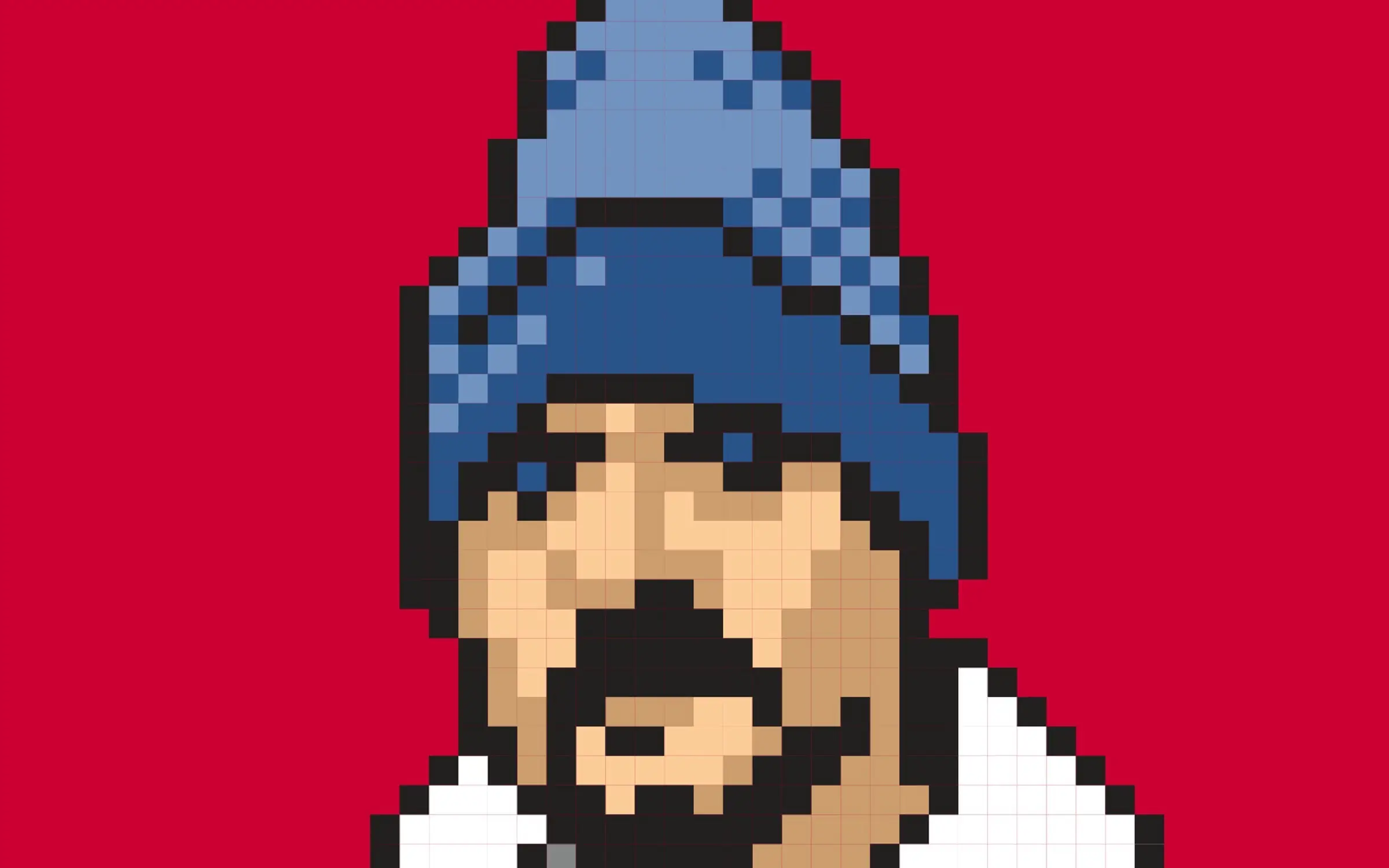
Illustration by Justin Dauer. Pixel portrait of JZ in blue beanie.

NONE of us knows what today will bring. And for many of us, these are fearful times. So I wanted to take a breath, pause a moment, and share two small gifts I received this morning at the start of my workday:

You know, for kids

First, Rob Ford wrote to my daughter and me to tell us that Macaw Books will be at Frankfurt Book Fair next week to promote The Little Trailblazers, a children’s book of illustrated stories to which we contributed.

It’s been more than two years since a younger Ava and I co-wrote a rhyming story for this collection of tales written by “Internet pioneers” and illuminated by brilliant illustrators from around the world—50 contributors from over 25 countries, 50/50 female/male ratio.

Book cover: The Little Trailblazers, designed by MENDO books.

When the book’s original publisher withdrew their support due to its lack of mass commercial potential, Rob could easily have given up. Instead, for over two years, he fought to find the right publisher and charity organization to align with the project.

Today word came that The Little Trailblazers will be in aid of Unicef’s work for children. I can’t think of a better fit. Rob’s vision and perseverance have been something to behold, and I am grateful to have had the chance to collaborate with my kid on what will be her first published story.

Art & copy

Next, Dougal MacPherson presented a trio of narratively related illustrations for an important upcoming A List Apart series directed by Aaron Gustafson. I’m thrilled that Aaron conceived the series, found the authors, chose ALA to publish it, and is shepherding the entire project. I can’t wait for you to read it.

And, although I should be used to it by now, I’m still gratefully astonished by Dougal’s ability to take complex, technical topics, find their common truth, and create a unifying visual narrative tying them together for A List Apart’s readers. Oh, and he draws great, too.

Breathe

There is much that can go wrong in our lives, most of it beyond our control. Sometimes how the afternoon sunlight looks as it warms the tops of trees is what you get that day to remind you that life is a gift. Or, hey, don’t knock a good sandwich.

But sometimes—especially if your line of work can at least partly be described as “creative”—sometimes you are reminded just how incredibly lucky you are to know and work with passionate, talented people. And that is fuel, not only for continued effort, but for gratitude.

Also published on Medium.
Illustration: Justin Dauer

Categories
Acclaim Advocacy Appearances art direction Best practices Brands conferences Damned Fine Journalism democracy Design Designers ForHire Ideas industry interface Layout Press Publications Publishing Redesigns reportage State of the Web Usability User Experience Web Design

Digital newspaper design challenge: a report from Poynter, part 1

CAN design create a better user experience that engages readers and drives revenue? Can it fight fake news and help save real journalism at a time when news organizations large and small are underfinanced and under attack?

These questions drove the Poynter Design Challenge, “a project to create new visual models for digital news publications” sponsored by William R. Hearst III, hosted by the Poynter Institute, and directed by publication designer Roger Black.

The challenge began October 17–18 in New York, with five pundits and five designers, of whom I was honored to be one, workshopping a project brief during a two-day conference event at the Columbia Journalism School. (You can watch videos of all these sessions courtesy of Fora.tv.)

The next phase took place yesterday in St. Petersburg, Florida, as the four other designers and I presented our work to a live audience. In this short piece, I’ll talk about the designs my colleagues presented; in the next, I’ll discuss my own.

Reconnecting with the people: the challenge for digital news

Roger Black described the difficulties facing digital news publications:

The challenge is serious. Fake news crowds real news. Numbers no longer add up for publishers. Readers jump from site to site without knowing where they are, or staying for long. You can see the brief for this project here.

Can design help? Well, as a I designer, I think it can. I mean, the design of most news pages is not what you’d call attractive. But the solutions proposed at Poynter will be much more strategic than cosmetic. And they’re strategies that can be combined.
Five design answers that add up, Roger Black, January 20, 2017

“A news publication might think a bit more like Fitbit”

News prototype by Kat Downs Mulder, Graphics director at The Washington Post.

Between us, we designers had about a century of experience designing digital publications—internally, as consultants, or both. This means that, even though an open “design challenge” brief necessarily omits an unknown number of the specific requirements any actual publication design assignment would include, all of us were aware of, and to some degree addressed, typical news publication requirements not included in our brief.

Kat Downs Mulder, Graphics Director at The Washington Post, shared a prototype for a big-brand news site. Kat had just given birth to a healthy baby boy (congratulations!), so her work was presented by two of her colleagues from The Post. Kat did not design with the avid, committed news reader in mind (since those folks are not the problem for most publications). Instead, she pondered how to engage the typically fragmented attention of today’s distracted and passive news reader:

“A big-brand news site [should be] aware that people have a lot more to do in their lives than read the news,” Kat posited. Thus, “A news publication might think a bit more like Fitbit. That is, it should make you feel like it’s working for you. A reader should say, ‘I’m reading everything I need to know.’”

Keep that dopamine pumping

Kat presented a multi-paned prototype. The wider pane on the right contained news content; the narrower pane at left was navigation. As I’ve just described it, this isn’t much different from the current Post website, but Kat’s prototype was very different, because it prized reader control over editorial director control; kept track of what you read; encouraged extra reading the way Fitbit encourages extra steps, and rewarded it the same way Fitbit does, with an accumulation of points that give the reader dopamine hits and create the perception that the “news app” is working for her—as a rewarding part of her busy lifestyle.

An Operating System for your city

Mike Swartz, Partner at Upstatement, a design and engineering studio in Boston, took on the challenge to smaller publications (such as his original hometown paper, the Pittsburgh Post-Gazette) which lack the resources of a Washington Post or New York Times.

Mike’s presentation, “information OS for a city: redefining the opportunity for local media,” turned the journalistic prowess of a good local paper into a superpower, connecting readers to their city the way the “terrible towel” stunt concocted in desperation by radio announcer Myron Cope in 1975 reconnected Pittsburghers to their hometown football team, and helped the Steelers win Super Bowl X over the Dallas Cowboys.

There’s a potential for an operation like the [Post Gazette] to rebrand itself as more of an “informational operating system” for its city. With different types of products that are focused and useful and not necessarily bundled into a traditional news format, we can create more enjoyable experiences and more useful products readers will love.

Building reader interest and finding a way to pay for it all

Lucie Lacava designed an app targeted at millennials.

Where the rest of us avoided the elephant in the room, in her design Lucie Lacava, president of Lacava Design Inc., boldly confronted the challenges of advertising and monetization. Algorithm-driven advertising frustrates users, who, in desperation, block it. Choked for income as a result, publications and advertisers create more and more intrusive forms of unwanted advertising. Nobody wins.

And while subscription models have worked, at least partly, for some of the very top news publications, such models are not likely to help most news publications in the near term.

Digital publication as digital application

Lucie’s design addressed these challenges by recasting the news as a hyper-customized application targeted at younger users, who get to choose news streams and ads that are relevant to them. “The elusive millennial” was Lucie’s target. I cannot do her idea justice with a couple of paragraphs and a single screen shot.

Affordable, immersive VR is here

Jared Cocken, brand and product designer for hire and co-founder of STYLSH.co., approached the “attention war” by showing how any size publication could create “video or VR driven stories that enrich a user’s understanding of the world around them.”

Because VR video is immersive, it holds viewer attention. Because it is reality-based, it fights fake news. (It’s hard to call bullshit on a scene you can explore from any angle.) VR also, potentially, builds compassion. It’s one thing to read about conditions in a Syrian refugee camp, another to visually experience them in VR.

Until now VR and video have been cost-prohibitive, but, working (and co-presenting) with VR startup founder Anna Rose and Hollywood producer/actor Banks Boutté, Jared showed how even woefully under-financed newsrooms can use newly designed, super-affordable tools to create “video or VR-driven stories that enrich a user’s understanding of the world around them.”

(For more on VR and the web, see webvr.info and VR Gets Real with WebVR by studio.zeldman’s Roland Dubois.)

Parting thought for now

Blogging about a conference is like tweeting about a sexual experience. You had to be there. I wanted to record and share the outlines of what my fellow designers presented, but these few paragraphs should in no way be considered authentically representative of the deep thinking and work that went into every presentation.

You may see holes in some of the arguments presented here. In some cases, I might agree with you—some ideas, while dazzlingly creative, did not seem to me like the right way to save news. But in most cases, if an idea seems wrong, blame my telling. If you had been there and heard and seen everything, the value of the proposal would have far more apparent than it can be here.

I love that each of us took on a quite different aspect of the problem, and addressed it using very different tools. I’ll be back soon with a short write-up of the design approach I took. Meanwhile, I want to thank all the pundits, designers, and attendees in New York and St. Petersburg—and the Poynter Institute, Roger Black, and William R. Hearst III for making it all possible.


Also published in Track Changes.

Categories
A Book Apart Acclaim Advocacy Appearances Design Publications Publisher's Note Publishing

Lara Hogan at Postlight

Lara Hogan, Rich Smartt, and Rich Ziade at Postlight.

LARA HOGAN kicked ass at the Lara Hogan Demystifies Public Speaking event sponsored by Postlight and A Book Apart, and held last night in Postlight’s big beautiful public space on Fifth Avenue, around the corner from NYC’s famous Union Square Park. Speaking coach Bill Smartt led the smartly paced Q&A session. Postlight co-founder and event host Rich Ziade introduced the event, and, as publisher of her new book, I had the honor and pleasure of introducing Lara.

Lara Hogan and Rich Smartt at Postlight.

When I first met Lara, she was touring behind her excellent O’Reilly book Designing For Performance, a topic she brought to life at An Event Apart in 2016. But, as important as performance is, I was even more excited to publish her new A Book Apart book, Demystifying Public Speaking, because, for nearly 20 years, I’ve impressed on my design/development colleagues and students the vital importance of public speaking to the success of their projects and careers—and now there’s finally a book that tells them how to do it.

I believe in public speaking (and writing) because a person who is comfortable sharing ideas and communicating to groups can evangelize designs, principles, and best practices. This in turn helps build consensus, support collaboration, and keep everyone’s eyes focused on what’s best for users—instead of, say, which colors a powerful committee member dislikes, or how much bigger we could make a button or logo.

Those who communicate comfortably, even when opinions vary and the subject is contentious, spread reassurance, which means the project not only focuses on the right things, but does so in a positive and supportive environment. Effective communicators inspire their groups to dig deeper and try more things—to work, and ponder, harder. This generally leads to more successful iterations (and, ultimately, projects), spreading good work in the community and leading as well to greater career success and longevity. Whew!

That’s why I speak. And why I strongly encourage my students and work mates to speak. Thanks to Postlight and to everyone who attended last night’s event.


Also published on Medium.