Tag: webdesign
-

My UX Superpower: Nothing Works!
Maybe I’m special. Or unlucky. But things that supposedly work intuitively for most users tend to fail spectacularly for me. After stints in academia, journalism, advertising, and music, I poured myself into web design in…
-

Accessibility 101
Nat Tarnoff covers the basics.
-
Of Books and Conferences Past
Of books and conferences past: A maker looks back on things well-made but no longer with us.
-

How to Join Blue Beanie Day: Wear and Share!
Saturday, 30 November 2024, marks the 17th annual Blue Beanie Day celebration. It’s hard to believe, but web standards fan Douglas Vos conceived of this holiday way back in ’07: The origin of the name…
-
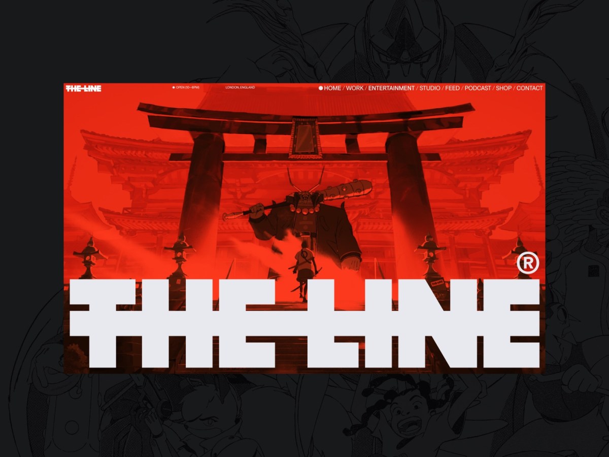
Web Design Inspiration
If you’re finding today a bit stressful for some reason, grab a respite by sinking into any of these web design inspiration websites.
-

For love of pixels
Stroll with us down memory lane as we celebrate the pearl anniversary of pixel art creation’s primary progenitor, and some of the many artists and design languages it inspired.
-

The More Things Change… (or: What’s in a Job Title?)
I’m designing for the web. The infinitely flexible web.
-
Enabling Folks to Express Themselves on the Web: State of the Word 2021
Bring popcorn.
-
My Night With Essl
Herewith, a scene from last night’s interview with legendary web & book designer (and Dean of The Cooper Union School of Art) Mike Essl, who shared his portfolio, career highlights, early web design history, and…
-
60+ Free WordPress Themes
Via instantshift.com Pulling the trigger just got easier. Now anyone can have a beautifully designed, standards-compliant WordPress site. The 60-plus recently created free WordPress themes (AKA template collections) listed by InstantShift’s Daniel Adams are categorized…
-
Chicago Sells Out
An Event Apart Chicago has sold out.
-
NYC microformats workshop
Attend the first-ever microformats workshop to be held in New York City. n Event Apart fans get 40% off the advance price of $195 (regular $375) with discount code aea40 when you order by midnight…
-
ALA 289: Redesign yourself
In Issue No. 289 of A List Apart, for people who make websites: 90% of web design is redesign. The hardest redesigns are the ones you do for yourself. In this special issue, we look…
-
Happy Cog and Airbag merge
Happy Cog™ and Airbag Industries, two leading and influential web design firms, announce that they are merging, effective today, August 3, 2009. The resulting super-agency will be called Happy Cog, and will maintain studios in…
-
The Amanda Project
Designed by Happy Cog and launched today, The Amanda Project is a media social network, writing project, and book series combined.