Category: Web Design History
-
RSS creator on Bluesky & AT Proto
Bluesky can’t abandon the developers who made a bet on AT Proto, so they should give the protocol to a standards body while catching up on UX.—Dave Winer
-
What a year that was.
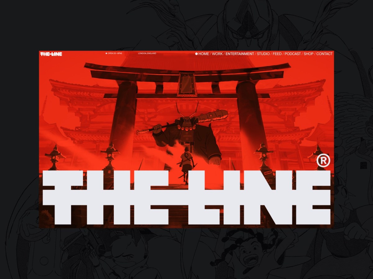
Know your web design history.
-
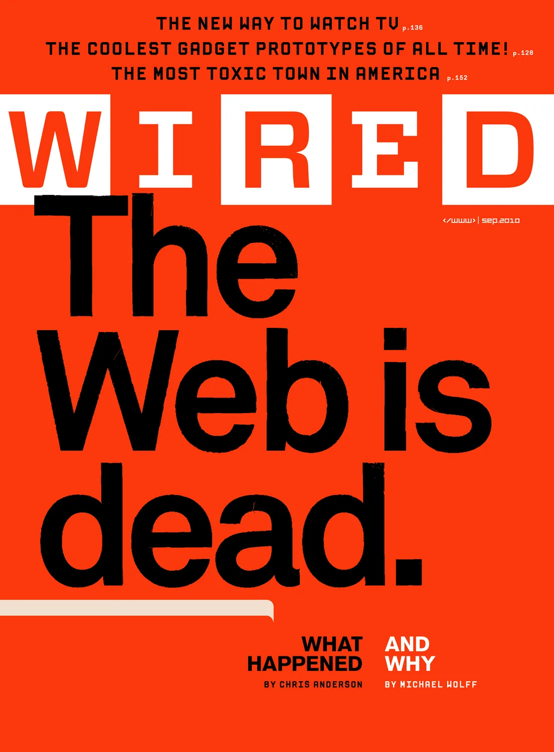
Receipts: a brief history of the death of the web.
They say AI will replace the web as we know it, and this time they mean it. Here follows a short list of previous times they also meant it, starting way back in 1997. Wired:…
-

Web typography: a refresher and history
A refreshing dip into what we’ve learned about web typography over the past 20+ years.
-

My weekend project
By controlling what I listen to, and the order in which I listen, I’m slowly designing an infinite collage of my evolving musical tastes.
-
Valediction.
What a ride that was.
-
Of Books and Conferences Past
Of books and conferences past: A maker looks back on things well-made but no longer with us.
-
How to Join Blue Beanie Day: Wear and Share!
Saturday, 30 November 2024, marks the 17th annual Blue Beanie Day celebration. It’s hard to believe, but web standards fan Douglas Vos conceived of this holiday way back in ’07: The origin of the name…
-
A List Apart contributors list on Bluesky
I’ve started a Bluesky list featuring some of the brilliant writers, designers, coders, editors, and others who’ve contributed to A List Apart “for people who make websites.”
-
Web Design Inspiration
If you’re finding today a bit stressful for some reason, grab a respite by sinking into any of these web design inspiration websites.
-
Ah yes, the famous “intern did it” syndrome
Poachers, when caught stealing content from our website, always blamed the theft on an “intern” or “freelancer.” We always pretended to believe them.
-

This Web of Ours, Revisited
Why did leading designers in 2000 look down their nose at the web? And are things any better today?
-

For love of pixels
Stroll with us down memory lane as we celebrate the pearl anniversary of pixel art creation’s primary progenitor, and some of the many artists and design languages it inspired.
-

The More Things Change… (or: What’s in a Job Title?)
I’m designing for the web. The infinitely flexible web.
-

“Where the people are”
Fortunately, on that day, I allowed a strong, simple idea to penetrate my big, beautiful wall of assumptions.