Category: business
Make them dance, make them dance.
-

The Secret
If I learned one thing in 25 years of running design and education companies, it’s that idealism isn’t a business strategy. If you wonder why my partners and I had to shut down organizations we…
-
Cold Storage
Good UX is what companies do when they have to. A company that has your stuff locked away doesn’t have to.
-
Behind every successful launch, there are 100 interesting failures.
We must stop thinking of failure as an end of something, and learn to see it as a natural part of progress. The first incarnation of a new idea may die, but the best ideas…
-
Too many meetings?
At Automattic, we know our time is finite and precious. Here are the questions we ask ourselves before agreeing to any meeting:
-
Domain harvesting and the Twitter long game in retrospect
Tricking people into seeing unexpected content and converting some of them into customers is a tale as old as the web. It was the perfect model for the takeover.
-
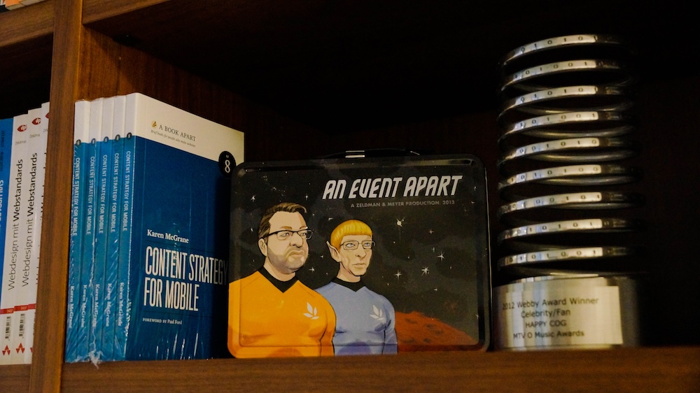
Of Books and Conferences Past
Of books and conferences past: A maker looks back on things well-made but no longer with us.
-
I stayed.
My insight into corporate legal disputes is as meaningful as my opinion on Quantum Mechanics. What I do know is that, when given the chance this week to leave my job with half a year’s…
-
One weird trick
Help to help, because we’re built to help.
-
Ah yes, the famous “intern did it” syndrome
Poachers, when caught stealing content from our website, always blamed the theft on an “intern” or “freelancer.” We always pretended to believe them.
-

Suckage begins here: why search engines now prioritize advertising over good UX
In the dying stages of innovation, companies at the top of the heap use their market power to maintain their high profits.
-

This Web of Ours, Revisited
Why did leading designers in 2000 look down their nose at the web? And are things any better today?
-

Don’t bring venture capital to a knife fight
Why you can’t build another Apple with VC bucks.
-

Our Lady of Perpetual Profit
A business world with deeply misguided priorities—exemplified by horror stories from the worlds of tech, gaming, and entertainment—accounts for much worker unhappiness and customer frustration.
-

The dogs won’t eat it
My father used to tell this story to his project management students.
-

See me speak: WordPress.com Growth Summit
WordPress.com is holding its first virtual conference, I’m speaking there, and you’re invited. The WordPress.com Growth Summit is a two-day live event where you can learn to build and grow your site, “from start to scale.” To make it…