Category: State of the Web
-

The More Things Change… (or: What’s in a Job Title?)
I’m designing for the web. The infinitely flexible web.
-
Our Lady of Perpetual Profit
A business world with deeply misguided priorities—exemplified by horror stories from the worlds of tech, gaming, and entertainment—accounts for much worker unhappiness and customer frustration.
-

CAPTCHA excludes disabled web users
The W3C explains how CAPTCHA excludes disabled users, and suggests alternatives that may be kinder and more reliable.
-

Heal an ailing web
Leadership, hindered by a lack of diversity, has steered away from a tool for public good and one that is instead subject to capitalist forces resulting in monopolisation. Governance, which should correct for this, has…
-

Open-source moderation
“Our online experience doesn’t have to depend on billionaires unilaterally making decisions over what we see.”
-

“Where the people are”
Fortunately, on that day, I allowed a strong, simple idea to penetrate my big, beautiful wall of assumptions.
-

In search of a digital town square
Ever since an infantile fascist billionaire (hereafter, the IFB) decided to turn Twitter over to the racially hostile anti-science set, folks who previously used that network daily to discuss and amplify topics they cared about…
-

Fly, my designers, fly!
Designers can either become drivers of business within their organizations, or they can create the businesses they want to drive. We’re entering an era of design entrepreneurship, in which some designers are realizing that they’re…
-
Algorithm & Blues
Examining last week’s Verge-vs-Sullivan “Google ruined the web” debate, author Elizabeth Tai writes: I don’t know any class of user more abused by SEO and Google search than the writer. Whether they’re working for their…
-
The Next Generation of Web Layouts
Who will design the next generation of readable, writerly web layouts? Layouts for sites that are mostly writing. Designed by people who love writing. Where text can be engaging even if it isn’t offset by…
-
He Built This City: The Return of Glenn Davis
You may not know his name, but he played a huge part in creating the web you take for granted today. And he’s back—kind of.
-
Saving Your Web Workflows with Prototyping
Our static tools and linear workflows aren’t the right fit for the flexible, diverse reality of today’s Web. Making prototyping a central element of your workflows will radically change how you approach problem solution and…
-
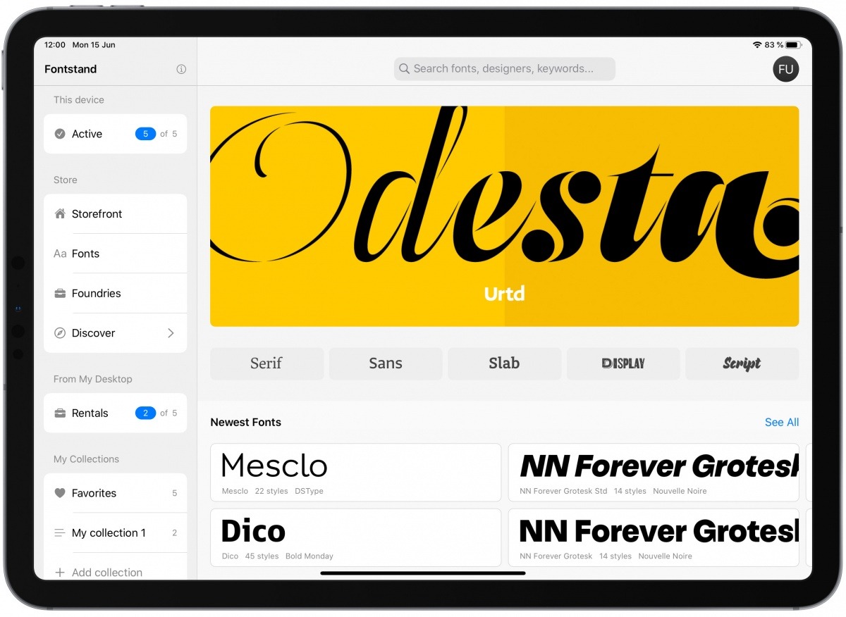
Pro Fonts for iPad
Designer fonts for your iPad (and iPad products).
-
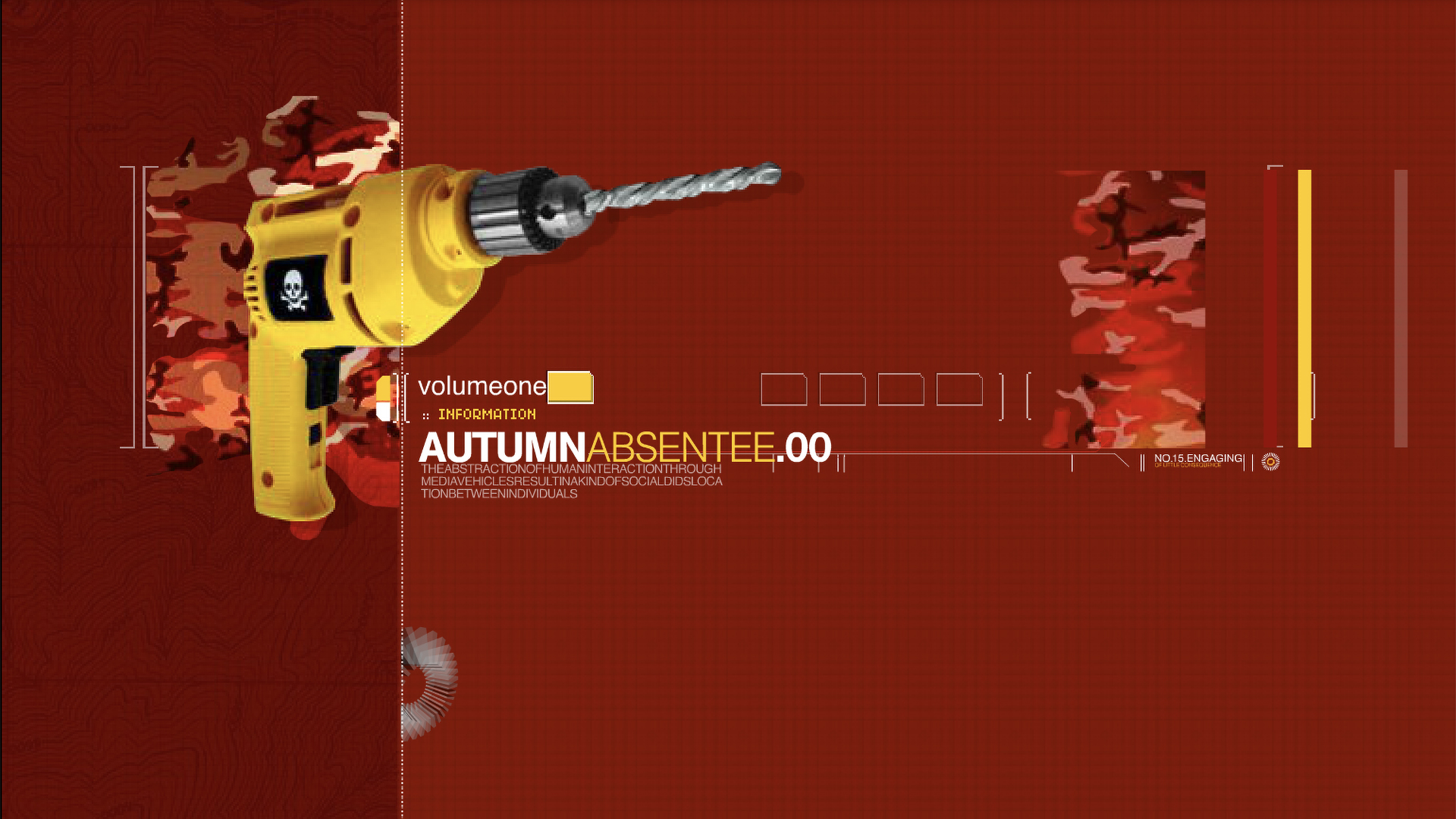
The Web We Lost: Volume One
I don’t miss Flash but I sure miss this level of creativity and experimentation on the web. As today’s “The Web We’ve Lost” exercise for designers, please take a look back at Matt Owens’s historic…
-

The Web We Lost: Luke Dorny Redesign
Like 90s hip-hop, The Web We Lost™ retains a near-mystical hold on the hearts and minds of those who were lucky enough to be part of it. Luke Dorny’s recent, lovingly hand-carved redesign of his…